































Windows 10 Icons - You cannot be serious, Microsoft!
Saturday, January 24, 2015 by Leo the Lion | Discussion: Personal Computing
http://www.neowin.net/news/windows-10-9926-here-are-the-new-icons
I'm flabbergasted!
All I can say is thank god for Iconpackager!
 |
|
Page 6 of 6 | |
|
|---|

Reply #102 Thursday, March 19, 2015 8:12 PM
Those are a LOT better. I really hope they launch with those instead of the craptastic ones they currently have.
Me too! 

Reply #103 Thursday, March 26, 2015 7:10 AM
Those are a LOT better. I really hope they launch with those instead of the craptastic ones they currently have.
Of course they do, its a community feedback based project...

Reply #104 Thursday, April 9, 2015 6:37 PM
Why are you surprised? Ballmer was an idiot, just check his onstage monkey dance on youtube. He had zero technical knowledge and vision, and his pet project was a computer screen on a kitchen table (the original Surface).
But he was probably good in one thing - he knew how to climb the corporate laddar, and how to surround himself with loyal idiots to exchange favors with.
The company took a nosedive under his direction, basically everything from his era was wrong, Windows 8 and Windows Mobile being the most glaring examples.
Now that he is gone, his loyal henchmen steer the wheel. The results correspond to their abilities.

Reply #105 Thursday, April 9, 2015 8:52 PM
So now they've changed the perspective of Live folders. What complications does that create for Icon Packager and Windows 7/8? Adaptable?

Reply #106 Saturday, May 30, 2015 8:56 AM
It seems microsoft listened, well at least up to a point.
The top row is 8.1, the middle is the first set of windows 10 icons and the bottom row is the newest windows 10 icons.

Reply #107 Sunday, May 31, 2015 11:08 AM

minimal very minimal 
they should have ask for help and not go solo on it.
those last shell icons are just destroying my eyes, i hope they consider changing 62988, 62999, 63000-1 aswell as 63008-11.

Reply #108 Sunday, May 31, 2015 12:17 PM
the bottom row is the newest windows 10 icons
There is zero, zilch, fech all improvement there, they're still butt ugly and that baby shit yellow is painful to look at. I will take the free upgrade but the UI and icons will last just a few seconds... like how ever long it takes me to remove them.


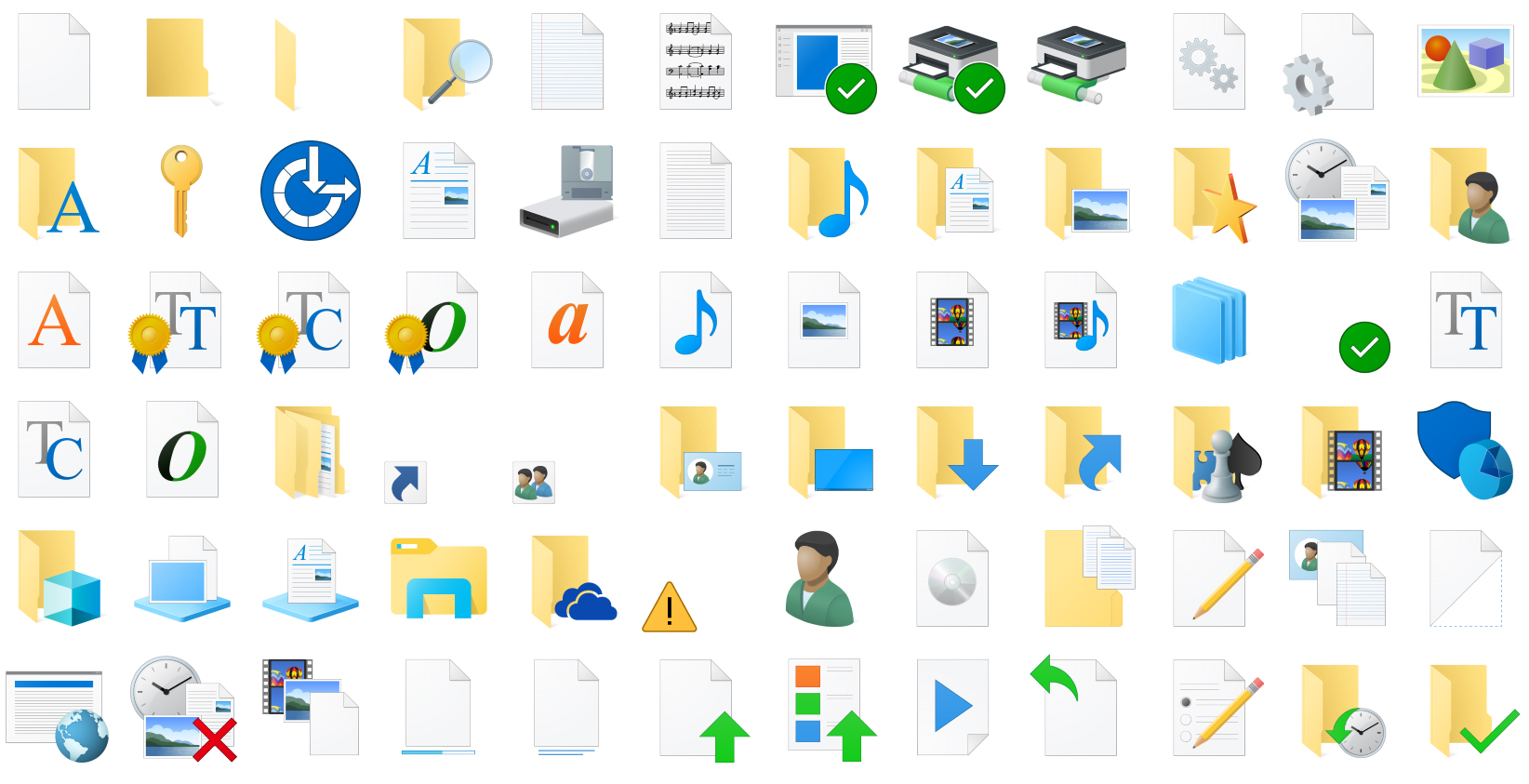


Reply #112 Sunday, June 21, 2015 9:13 PM
I do wonder why desktop, network printer, and Romdrive floppy icons aswell as the key look like someone spended more time on them.
While the folder stays in polygon shape and does not have any depth to it.
Mhh but the colors are better than the first pack.
Please login to comment and/or vote for this skin.
Welcome Guest! Please take the time to register with us.
There are many great features available to you once you register, including:
- Richer content, access to many features that are disabled for guests like commenting on the forums and downloading skins.
- Access to a great community, with a massive database of many, many areas of interest.
- Access to contests & subscription offers like exclusive emails.
- It's simple, and FREE!
|
|
Page 6 of 6 | |
|
|---|
Reply #101 Thursday, March 19, 2015 8:01 PM
They may be listening...
http://www.neowin.net/news/microsoft-asks-for-feedback-on-windows-10-icons-shows-off-entirely-new-set
Those are a LOT better. I really hope they launch with those instead of the craptastic ones they currently have.