






























Microsoft Introduces a New Corporate Logo
Thursday, August 23, 2012 by Island Dog | Discussion: WinCustomize News
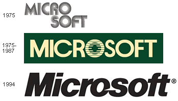
Microsoft has introduced the new corporate logo. The last time this was updated was 25 years ago, and comes in line with the Windows 8 design.
What do you think?

http://blogs.technet.com/b/microsoft_blog/archive/2012/08/23/microsoft-unveils-a-new-look.aspx
 |
|
Page 1 of 3 | |
|
|---|




Reply #7 Thursday, August 23, 2012 10:52 AM
wow....4 colored boxes and the word Microsoft.....I'll bet it took them weeks of brainstorming to come up with that one. -- Ace --

Reply #9 Thursday, August 23, 2012 11:03 AM
Yeah, and like the dummies they are of late, they probably paid some company $50,000 to come up with it! 


Reply #11 Thursday, August 23, 2012 11:19 AM
constructed, hard, uniform, unbending, solid, no free flowing lines, no modern round soft shapes or good feel colours ... as Jafo said 'Bland'
Big risk linking a logo to a non proven product ... you should only change your logo if you are trying to reconnect to the customers and want to repackage your company ... would be ideal for a company which makes kids colour blocks, and they would use bright happy (not old man safe) colours.
Now I look at it, it doesn't have any active elements creating movement ... 
Reply #12 Thursday, August 23, 2012 11:40 AM
They should have used the Windows7 flag. It is the last known good configuration. 


Reply #14 Thursday, August 23, 2012 12:25 PM
The letters are still in the correct order. That's something to be pleased about.

Reply #15 Thursday, August 23, 2012 2:08 PM
Clearly they should have asked VStyler to do one for them.

Reply #17 Thursday, August 23, 2012 2:44 PM
Quoting DaveRI, reply 15Clearly they should have asked VStyler to do one for them.
Yep, and they should have had him design the Windows 8 GUI too!
Would look one helluva lot better.... and then I could bug him about the Start Button forever! 
Reply #18 Thursday, August 23, 2012 2:53 PM
Guys, I hate to break it to ya....
That's not a Corporate Logo...it's a Corporate Nogo. 

Reply #19 Thursday, August 23, 2012 3:22 PM
It has always been said that Microsoft was rather good with software but short on artistic ability.... now it seems [with Win 8's "don't call it Metro anymore" on the horizon] both abilities are in serious doubt.
Now if anybody wanted to know how lo Microsoft could go, they only have to look at the lo go to see it's way down there with the cellar dwellers...
..... and I'll bet Beelzebub is resenting the rude incursion into his depths....


Please login to comment and/or vote for this skin.
Welcome Guest! Please take the time to register with us.
There are many great features available to you once you register, including:
- Richer content, access to many features that are disabled for guests like commenting on the forums and downloading skins.
- Access to a great community, with a massive database of many, many areas of interest.
- Access to contests & subscription offers like exclusive emails.
- It's simple, and FREE!
|
|
Page 1 of 3 | |
|
|---|
Reply #1 Thursday, August 23, 2012 10:12 AM
Bland.