































Wallpapers in progress
For those wanting serious critiques only!!
Saturday, October 23, 2010 by teddybearcholla | Discussion: Wallpapers
Thought I would start this thread in the hopes that there will be good and serious critiques. I can be your first *victim* IR or whomever wishes to give me direction!!! 
 This is in progress....it is a photo I took and then added the little ghosties...which may or may not work.

 |
|
Page 9 of 14 | |
|
|---|

Reply #162 Tuesday, November 2, 2010 10:35 PM
That is a big improvement!
There seems to be something not quite right about the clouds. If you are going for a foggy look, maybe make the clouds less "puffy" looking, more hazy...and the farther you look into the distance, the less you should see.
If it's a partly cloudy day, I would suggest geting the clouds off the water and giving them more depth, maybe with more layers of them and more light and dark parts of them....if that makes any sense.

Reply #163 Tuesday, November 2, 2010 11:05 PM
Actually, at the moment all I have are rendered clouds as I was spending so much time on it, I wanted to know if it had potential before I did anymore. I was thinking to blur the water line and add more clouds. As I said, right now it is just rendered clouds with a gradiant mask. I learned quite a bit about using masks in some tutorials yesterday while my system was down and I was using the "ancient one" which won't run photoshop so it forced me to stop trying to create and try and learn something!

Reply #165 Tuesday, November 2, 2010 11:34 PM
Grass in the middle is flat...2D....the bit to the right side is better.
The clouds between the viewer and the water look more like smoke.
The 'grass' "brush" is still evident..... identical bits of grass....rather unlikely.

Reply #166 Wednesday, November 3, 2010 12:05 AM
MUCH better, Frankie!  Maybe cast a faint shadow of the hawk on the water. I agree with the Xiandi, that the clouds need work. Could you bring in a cloudy sky stock photo rather than render clouds?
Reply #167 Wednesday, November 3, 2010 12:30 AM
I was trying to keep it stock free if I could. I have done some clouds, now tell me what you all think. Jafo, you are a hard man to please! I will revisit the grass tomorrow. ( and maybe the clouds too!)
Reply #168 Wednesday, November 3, 2010 1:46 AM
The clouds do look much better now, much more depth to them. IMO, I think the part of the clouds that is kind of peach color should be desaturated a tiny bit as it gets closer to the water, the sunlight would fade a bit there because it has to go through the fog. The peach up high is great.
The improvement from the original is quite dramatic now.
Reply #169 Wednesday, November 3, 2010 1:56 AM
Well, thank you for that. It was headed for the recycle bin but perserverence won out.I did add that tiny bit of reflection under the hawk and thought a shadow would be overkill. Not quite sure how to desaturate part of that layer and not the rest. It's late and I'm tired! I'll leave it go til tomorrow and see if I can change up the grass a bit.
Reply #170 Wednesday, November 3, 2010 2:52 AM
To me, it looks like the hawk is just above the edge of the water and the land, therefore you would not be able to see his shadow...
I guess you're right. I need new computer glasses.
I agree.
Reply #171 Wednesday, November 3, 2010 7:38 AM
Perspective reads there will be no reflection of the hawk....
If you "must" use a brush for your grass....[the blobby ones]....post-edit by altering them so they do not appear identical/repeated.


Reply #173 Thursday, November 4, 2010 1:57 AM
I've done a bit more refining and tried to change up the grass. I guess the tuts I read on doing grass were all wrong, Can someone suggest a good site for Photoshop tutorials? I know there are scads of them but which do you think is the best or that you would use?
Reply #174 Thursday, November 4, 2010 6:51 AM
frankie, i would be moving the trees from the eges, they keep drawing the eyes to the edges of the wallpaper and not to the centre.
my eye direction goes in this order, tree, edge. bird, tree, edge, water, tree, edge.
sounds stupid i know.... but your main aim is to have the audience attention on what you want them to look at most, in other words, what is your focal point? and make the surrounding images force the eyes to centre on it. xxxxx
if your bird is the focal point, you need to truly change the trees, they are too dominant..
faint mountains on the other side of the river would aid as an arrow towards the bird (why as an arrow? because a mountains goes straight up
and so will the eyes)
Reply #175 Thursday, November 4, 2010 6:55 AM
i would also be adding light to the trees, bird, grass ect from where the light is coming from, this will give it more depth and more oomph.
Reply #176 Thursday, November 4, 2010 9:15 AM
Still like the 'Where's Wally' game....where's the cloned grass.
Once you see them they stand out like festering warts....
Reply #177 Thursday, November 4, 2010 3:42 PM
I did not clone anything in the image. I removed all of the grass I did with the scatter brush and replaced with individual grass brushes, each of them different. The foreground plants are masked in from an actual photo and appear as they do in the photo. I guess I don't follow what you are referring to.

Reply #178 Thursday, November 4, 2010 4:44 PM
IMO not specifically grass, but the flat flower looking things. One can assess they were either brushes or copy pastes of the same image just size,hue and angles changed.
Also the bird looks out of place has no depth to it. Try adding a larger transparency to the edges of the wings and a slightly smaller one to the body, as the feathers are generally thin around the edges and seem almost semi transparent in flight when the light source is behind the subject. it also could use a slight bit more texture as it looks washed out or "Flat" if you will. If your resizing it try using lanczos3 interpolation to keep as much of the texture as possible.
Tip#1." For everyone not specifically you" When you resize a item always resize from the original source, as then you will always get the best quality. Resizing from a resized image leads to loss of depth and textures generally.
The dead looking sapling far left bottom, it's got a crisp focus while the surroundings are slightly blurred, it looks "planted". Same as the sticks far right sticking out around the tree trunk, too sharp to fit the rest of the scene.
The center of the sky under the bird is slightly distorted "semi pixelized", try softening it.
[e digicons]:karma:[/e]
Reply #179 Thursday, November 4, 2010 6:31 PM
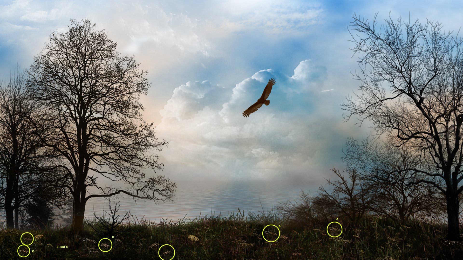
Quite self-evident.
The foreground doesn't have sufficient 'depth'.... still gives the impression of being more a hedge than a field. and there probably needs to be more visible cues to equate the foreground with the 'horizon' view-point. The third dimension is still vague. [but getting better].
Reply #180 Thursday, November 4, 2010 7:11 PM
i did a short mockup editing the bird to show how a bit of texture and transparency can make it seem more realistic.
 Uploaded with ImageShack.us
Please login to comment and/or vote for this skin.
Welcome Guest! Please take the time to register with us.
There are many great features available to you once you register, including:
- Richer content, access to many features that are disabled for guests like commenting on the forums and downloading skins.
- Access to a great community, with a massive database of many, many areas of interest.
- Access to contests & subscription offers like exclusive emails.
- It's simple, and FREE!
|
|
Page 9 of 14 | |
|
|---|
Reply #161 Tuesday, November 2, 2010 10:25 PM
I have been trying to rework this image. If it's a waste of time, please let me know or if anyone has some useful advice, it would be welcome.
