






























Wallpapers in progress
For those wanting serious critiques only!!
Saturday, October 23, 2010 by teddybearcholla | Discussion: Wallpapers
Thought I would start this thread in the hopes that there will be good and serious critiques. I can be your first *victim* IR or whomever wishes to give me direction!!! 
 This is in progress....it is a photo I took and then added the little ghosties...which may or may not work.

 |
|
Page 8 of 14 | |
|
|---|
Reply #142 Monday, November 1, 2010 2:24 AM
wasnt trying to make you sound cheap Frankief......i was trying to give the technical side of art advice....... its truly something people need to look into... but jafo is right, it CAN be done....but properly.

Reply #143 Monday, November 1, 2010 2:44 AM
It's all good, I have had formal art classes, but doing art on paper and doing art on screen can be a big learning curve and trying to draw with a damn erratic mouse is next to impossible. The tablet was at the top of my list before I lost my job. Had all intentions of getting one and learning how to use it. I am just not feeling too good about myself in general these days. I think I am still in mourning over the job and have recently found out that my Mom has cancer and my little girl is in a toxic marriage and I could go on , but I won't. Back to the tutorials for me!


Reply #144 Monday, November 1, 2010 2:56 AM
You could try asking for one on Freecycle. http://www.freecycle.org/ Find the group in your area and post a wanted ad--I can't believe some of the stuffy my group gives away when people ask. Somebody might have one in storage they don't really plan on using, but since it's still good, they don't want to toss it in the trash. I got mine from my son who got it from a guy he went to college with who was just going to throw it away.
Depressing life situation is about 50% of why I bury myself in my art. Keeps me from thinking too much about stuff I can't change anyway. I hope things get better for you soon, Frankie, and that you're mom beats the cancer and that your daughter figures out what she needs to do about her marriage.
Reply #145 Monday, November 1, 2010 3:07 AM
Thanks Karen, I will definately look into that.
Momma is 85 and it's in her lungs so don't think the long term prognosis is good and her being so far away and not being able to be there is hard. My daughter is in denial and cannot see the harm she is doing to her son by trying to preserve something that is harmful to both of them. I am not feeling so hot about my artwork lately so that outlet that you speak of just does not hold my interest as it should. This too shall pass and I know that.

Reply #146 Monday, November 1, 2010 1:53 PM
Cut-and-paste "can" work, however there are several MORE steps in doing it.
First is to take EXTREME care with choices....light intensity/quality/source is just one of the issues....getting them to match within the overall composition...and it's typically the first mistake made by most.
Second is to understand [in 3D images] - PERSPECTIVE [and that also includes SCALE]. You "can" have more than one vanishing point...in fact Real-Life [tm] DOES. The last 'proper' Perspective I did [for work] had somewhere around 17 generated.
Third is BLENDING. Hide the 'cutting'.
The problem is....the 'art' of cut-and-paste originates with ankle biters in primary school....scissors and clag. It takes somewhat MORE skill and practise to take the method beyond childhood 'art and craft'.
I must admit getting a smile out of the wall upload that showed Lake Louise [Canada] with the monster duck on the lake..... perspective would have it at about 20 FEET long [not inches]. I was there last year....pretty sure they were smaller....
without predjudice
I imagine this is in reply to my request for comments on 4 Halloween walls that were refused recently, Thanks for the reply but I don't see anything about the walls in question. I know you were in Lake Louise, I read it when you wrote it way back when. It's so long ago I can't remember when. I am glad it made you smile. BTW I figured the height from the balcony to where the loon was at 20 -30 feet , so I guess I wasn't that far off, in my calculations. Thanks for that reassurance. What is off is why bring that one up here and now? Is there something you want to add, like constructive criticism, to help me
Thank you for likening my work to childhood school cut and paste, I used to like doing it and the memory was nice, Why are you being so mean and vindictive here in this thread. If you have a problem with me or my art than send me a PM, please, since obviously, my work is not up to standards, That way I can stop wasting my time answering things like this. If you have something personal I would love to know what your problem is. You seem very mean and vindictive towards Frankie, in this thread. The wall was mine, not Frankie's. You are a moderator, I do not believe this kind of behavior is acceptable. I am sorry if I have offended you. I try to follow your advice by just staying away from a person I had problems with, ring any bells? What I see is sheer provocation and I object. I know my opinion and 50 cents won't even buy a coffee, but I am a paid subscriber here and at Stardock and demand a certain level of respect.
Reply #147 Monday, November 1, 2010 1:58 PM
Momma is 85 and it's in her lungs so don't think the long term prognosis is good and her being so far away and not being able to be there is hard. My daughter is in denial and cannot see the harm she is doing to her son by trying to preserve something that is harmful to both of them. I am not feeling so hot about my artwork lately so that outlet that you speak of just does not hold my interest as it should. This too shall pass and I know that.
Frankie I am so sorry to hear about your mother. I understand very well how you feel because I saw how my own Cancer affected my family. Knock wood it's over 3 years since my last chemotherapy and I am in remission. If you ever want to talk about it or anything else, any time, yo know what to do. Everyday I pray and I am not a religious person, by reciting the Serenity Prayer. It helps Frankie. Talk to you soon.

Reply #148 Monday, November 1, 2010 7:29 PM
skyzyk...
I was hardly being mean and/or vindictive.
Your name was not even mentioned in my reference to Lake Louise.
It was/is simply one anecdotal example of an incorrect attention to scale and proportion.
Other than an un-named and unattributed example ALL of my comment was/is intended as GENERAL and affects all who attempt to use cut-and-paste in graphic composition.
This is neither specific to wallpapers nor even to digital art. It applies universally in graphics.
Also...
I am NOT 'mean and vindictive' towards ANYONE in this thread, or anywhere else. I have no interest in being such.
What I HAVE offered here, however is clear, precise and HONEST criticism....if requested. I see no value in caressing people's ego with one hand while indicating fault and failing with the other. I leave that to the artists' fans/followers instead.
Reply #149 Monday, November 1, 2010 7:44 PM
I was hardly being mean and/or vindictive.
Your name was not even mentioned in my reference to Lake Louise.
It was/is simply one anecdotal example of an incorrect attention to scale and proportion.
Other than an un-named and unattributed example ALL of my comment was/is intended as GENERAL and affects all who attempt to use cut-and-paste in graphic composition.
This is neither specific to wallpapers nor even to digital art. It applies universally in graphics.
Also...
I am NOT 'mean and vindictive' towards ANYONE in this thread, or anywhere else. I have no interest in being such.
What I HAVE offered here, however is clear, precise and HONEST criticism....if requested. I see no value in caressing people's ego with one hand while indicating fault and failing with the other. I leave that to the artists' fans/followers instead.
I did not take anything you said personally, just as constructive criticism in general. I have looked back at some of my early "cut and paste" efforts and had a good laugh at myself. I truly hope we can keep this thread alive without such controversy as I feel it is helpful to note the critiques and apply them to my own work.
Reply #150 Monday, November 1, 2010 8:17 PM
I agree %100 Frankie. I only wish I could get some more opinions. To date only one person has has, but in the meantime I copy paste all the recommendations and opinions because I know they will apply to one of my works one day. I only want to learn how to improve my works, as you do. You know little ole sensitive me, always willing to help others also if I can to help promote the community spirit. No problemo 


Reply #151 Monday, November 1, 2010 8:40 PM
I would just like to point out that tbc started the thread for critiques.
Not everyone is right and some critiques could be against what your ideas are. Take out what you think is good, ignore the bad and learn from others' opinions.
It will only make you a stronger artist 
Reply #152 Monday, November 1, 2010 8:44 PM
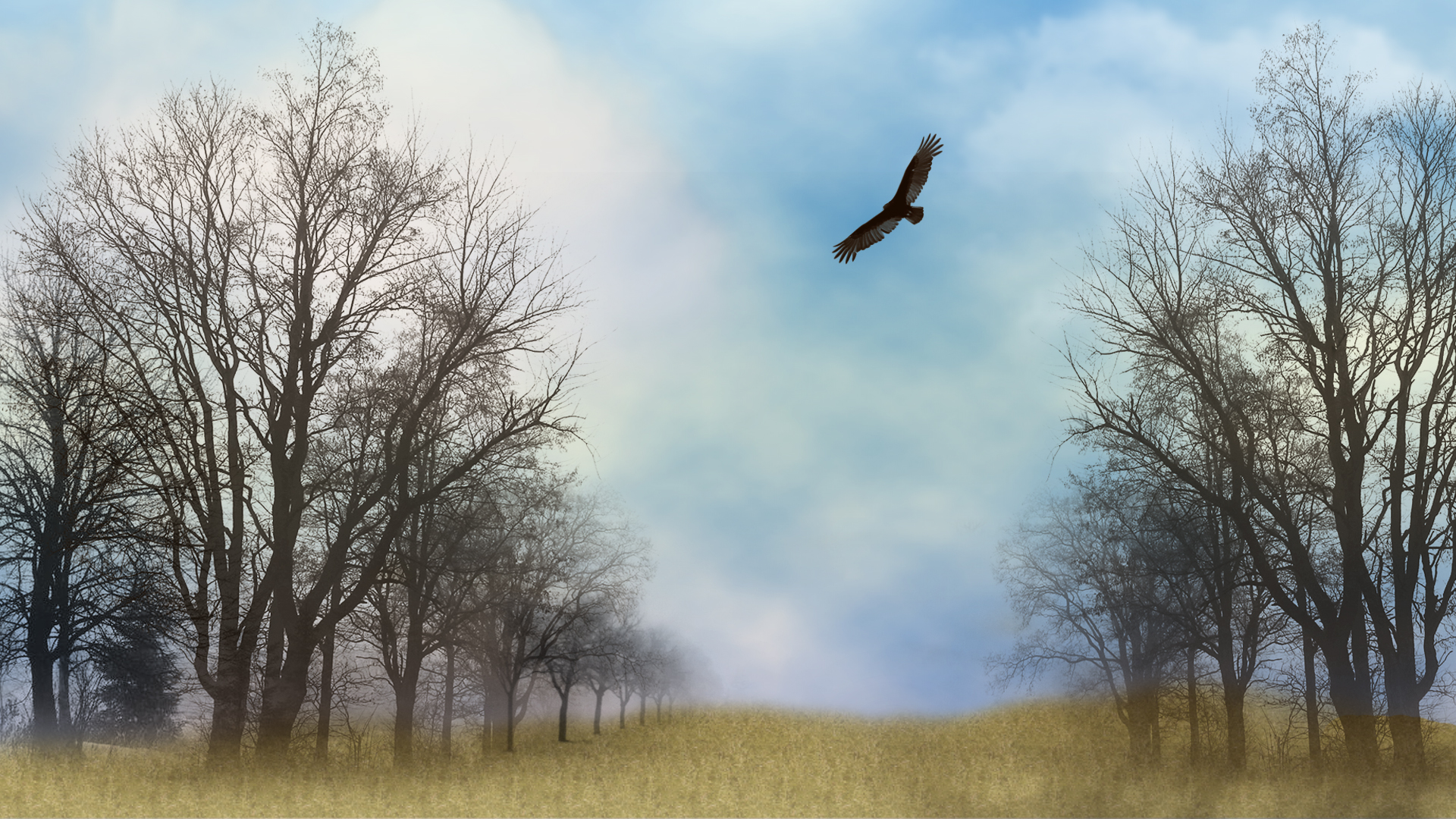
So, anyone: Where did I go wrong with this? The transparency in the brushes?
Reply #153 Monday, November 1, 2010 9:29 PM
The transparency of the brushes, definitely, but also the blurring of the background seems unnatural to me, and (this could just be my tastes), it BEGS for something big, and focused in the middle. The trees are pulling my eyes to the center of the canvas; the hawk is too high for that focus to be satisfied. Perhaps a huge setting sun at the horizon line (of course, then you would have to do more with the sky).
Reply #154 Monday, November 1, 2010 10:50 PM
First mistake...mirrored trees.....another common fault with copy/paste.
No two trees will be alike, and your audience won't be tricked by/with mirrors.
The grass/ground has no substance...unless the intent is to represent trees growing on grassy [ish] clouds...
Reply #155 Monday, November 1, 2010 11:12 PM
The trees are brushes, but yes I did use the same brush on each side adding more to the left side. I was attempting to create the ground cover with only brushes and texture but I grab from what you are saying that I went too soft with it. I was going for dreamy but I guess the whole image is too soft. Did I interpret correctly?
Reply #156 Monday, November 1, 2010 11:36 PM
I think if you're going to go dreamy, then everything needs to be soft. The hawk is super sharp, so the dreamy effect comes off looking a little dirty.
Reply #157 Tuesday, November 2, 2010 1:12 AM
There's the fundamental issue with 'brushes', as with all image generators.
Traditional 'art' would see a 'brush' as a stick-with-hair-attached - used to apply individual strokes from personal, human input/creativity. There can be NO repetition of 'pasted' images without deliberate intent.
If you 'paint' each tree as you would in non-digital imagery....by hand....then there's no danger of repetitive images....
Reply #158 Tuesday, November 2, 2010 1:26 AM
I'm not having much success "Painting" with this damn mouse!
Reply #159 Tuesday, November 2, 2010 3:01 AM
'Painting' can be done with a mouse...as unlike 'normal' artforms digital 'art' has the option to zoom in on detail.
It is not uncommon for skinners [in particular] to deal with images at an INDIVIDUAL per-pixel level.
This is what often differentiates skilled creativity from 'filter frenzies'....the latter is typified by what was/is commonly refered to as 'blue swirlies' - one of the no-no's of wallpapering....

Reply #160 Tuesday, November 2, 2010 3:35 AM
Frankie...the grass/ground looks cloned... the brush or cloning looks artificial because there are no 'identical' plants (like trees).
Please login to comment and/or vote for this skin.
Welcome Guest! Please take the time to register with us.
There are many great features available to you once you register, including:
- Richer content, access to many features that are disabled for guests like commenting on the forums and downloading skins.
- Access to a great community, with a massive database of many, many areas of interest.
- Access to contests & subscription offers like exclusive emails.
- It's simple, and FREE!
|
|
Page 8 of 14 | |
|
|---|
Reply #141 Monday, November 1, 2010 12:21 AM
That Loon would have had to have ATC clearance to land on the lake.....
"The mosquitos were so big at Darwin airport we pumped 500 gallons of Avgas into one before we realized it wasn't a plane..."