































Assimilation V3
Thursday, August 19, 2010 by 2of3 | Discussion: Sneak Previews
I have always wanted to to the "ultimate" borg blind.
My first attempt was made in 2007.
Assimilation
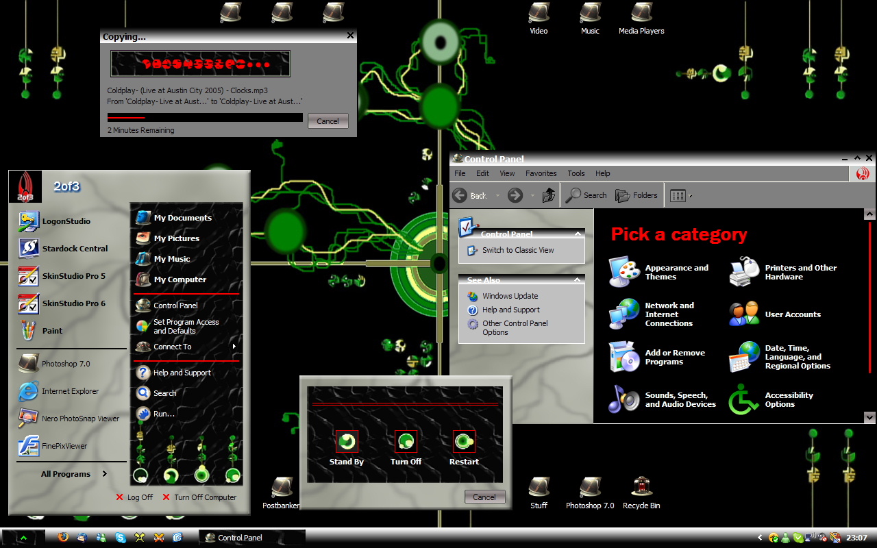
I was immensely proud of it when I finished it and uploaded  ........but.......look at it!
  Oh well, I keep it up to remind me of how far I've come.
Attempt 2 in 2008 was a bit better.
Assimilation V2
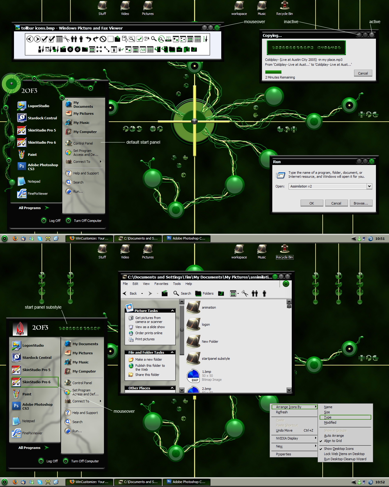
A real improvement but still kinda.............meh!
I guess it's time to try again, so I give you
Assimilation V3
First, the concept drawing in photoshop

Here's how it's looking as of today. Still lot's to do 

I don't know if this is the "Ultimate Borg Blind" or not but I think it's looking pretty damn good!

 |
|
Page 1 of 4 | |
|
|---|


Reply #3 Thursday, August 19, 2010 12:54 PM
Tim! This is great! I love the nav buttons too, Cyndie! I'm gonna love seeing what you're gonna do to the taskbar! 

Reply #4 Thursday, August 19, 2010 12:58 PM
Looking very good Tim, this falls into the category of 'Keeper'.

Reply #6 Thursday, August 19, 2010 1:50 PM
Thanks, guys!
I forgot to say that the hoses that connect the startpanel to the taskbar are actually part of the start button. That way, I could have them show only when the start panel is open (no silly looking hoses connecting to nothing) Shown here with start panel collapsed and windows rolled up.


Reply #7 Thursday, August 19, 2010 2:12 PM
Please have a substyle with teh inside of the eye image from v1 and v2 . .
TRADITIONNNN! TRADITION!
Reply #8 Thursday, August 19, 2010 3:23 PM
TRADITIONNNN! TRADITION!
If you mean the "borg skin", I don't see why not

I may want to redraw it, though the gray tone isn't quite right.

Reply #9 Thursday, August 19, 2010 3:30 PM
I really like the first two versions and it looks like this one will be the best yet! 


Reply #11 Thursday, August 19, 2010 5:07 PM
A little bit of a white or green or light grey glow behind the black text on grey would look pretty cool, and help with the contrast for reading.
I am really diggin' it though... keep up the good work.
Marination almost always enhances the flavor.

Reply #12 Thursday, August 19, 2010 5:47 PM
looking terrific....a damn fine design....and a cool evolution of your skills... gonna be a ripper... 

Reply #13 Thursday, August 19, 2010 10:47 PM
Tim, this is an excellent progression and I'm looking forward to its release... top shelf stuff, that.

Reply #14 Thursday, August 19, 2010 11:04 PM
I'd like to see more complexity Tim, a couple of wires, does not a Borg blind make eh? Cmon, dig deeper, yew can dew eet !

Reply #16 Friday, August 20, 2010 9:38 AM
You are totally right, John. I just said to Xiandi the other day that this is not the time to be wimpy and go for safe. I need to follow my own advise, I guess.
I'm reworking the graphics and here's how it looks so far.

Right now, I'm just drawing. I'll worry about how to actually make it work later 


Reply #19 Friday, August 20, 2010 8:52 PM
Indeed! 1000% better.
A Borg theme deserves nothing less than intricate, tiny details to every aspect. I'd hate to see it rushed.
Take your time with it.
Reply #20 Saturday, August 21, 2010 1:01 PM
Just adding more detail. Kinda in the Borg style adding layers with little regard for symmetry. 

Please login to comment and/or vote for this skin.
Welcome Guest! Please take the time to register with us.
There are many great features available to you once you register, including:
- Richer content, access to many features that are disabled for guests like commenting on the forums and downloading skins.
- Access to a great community, with a massive database of many, many areas of interest.
- Access to contests & subscription offers like exclusive emails.
- It's simple, and FREE!
|
|
Page 1 of 4 | |
|
|---|
Reply #1 Thursday, August 19, 2010 10:53 AM
3rd times a charm! Everything about this skin is really impressive.