






























Assimilation V3
Thursday, August 19, 2010 by 2of3 | Discussion: Sneak Previews
I have always wanted to to the "ultimate" borg blind.
My first attempt was made in 2007.
Assimilation
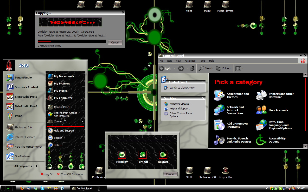
I was immensely proud of it when I finished it and uploaded  ........but.......look at it!
  Oh well, I keep it up to remind me of how far I've come.
Attempt 2 in 2008 was a bit better.
Assimilation V2
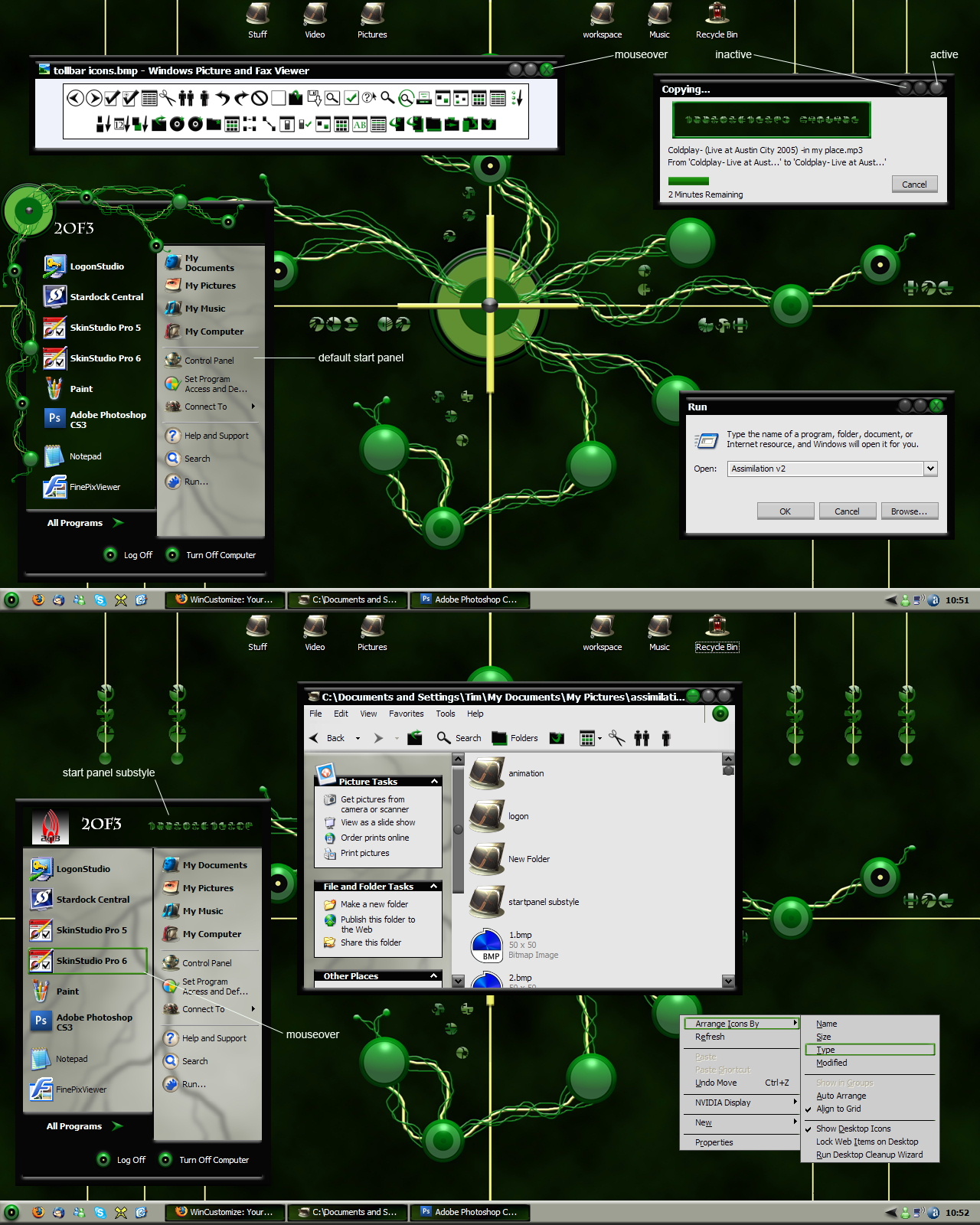
A real improvement but still kinda.............meh!
I guess it's time to try again, so I give you
Assimilation V3
First, the concept drawing in photoshop

Here's how it's looking as of today. Still lot's to do 

I don't know if this is the "Ultimate Borg Blind" or not but I think it's looking pretty damn good!

 |
|
Page 2 of 4 | |
|
|---|

Reply #22 Saturday, August 21, 2010 2:35 PM
Much of the Borg gear is black leather-like. Will we be seeing any of that?

Reply #23 Saturday, August 21, 2010 2:57 PM
TRADITIONNNN! TRADITION!
Speakin' 'o tradition, are we gonna stick with the originals' dark/black background and white text?
There's a REAL shortage of good, properly working blinds with dark backgrounds like that,
which is a real pity, coz it cut down on that late-night white screen glare eye-pains...
Reply #24 Sunday, August 22, 2010 7:57 AM
Thanks for your interest everyone. I'm going on vacation for a month starting tomorrow. I'll pick up work on this again in late September

 have a safe trip....enjoy your hols....



Reply #30 Sunday, September 5, 2010 4:45 PM
Ditto @ Xiandi. Tim, this one is fine art at it's best! Work that can only be done by a true Master! Thanks!
BTW, Updates? lol 
Reply #31 Monday, September 6, 2010 12:20 PM
Task Manager:

Note also the text color change on the groupbox header
Reply #32 Monday, September 6, 2010 9:22 PM
Tim, when you're almost done, can I porn this? Please??? 
Reply #33 Tuesday, September 7, 2010 3:06 PM
no problem, ho


Reply #37 Friday, September 24, 2010 6:59 PM
You could have left one here in the States, you know. 


Reply #38 Friday, September 24, 2010 7:21 PM
Nice Tim, Im a bit conficted about white text in some areas, menus etc, and dark in others, start menu, the white text doesnt seem borgish enough, I don't.... fear... it? ... and in general doesn't match up well in my eyes.
Graphically, looking tight mate, much improved from early versions 

Reply #40 Monday, October 18, 2010 6:18 PM
Slow but sure

Many of the things I'm working on now are more "behind the scenes" things......IE stuff you wouldn't see on a day to day basis, but still need to be skinned.
Please login to comment and/or vote for this skin.
Welcome Guest! Please take the time to register with us.
There are many great features available to you once you register, including:
- Richer content, access to many features that are disabled for guests like commenting on the forums and downloading skins.
- Access to a great community, with a massive database of many, many areas of interest.
- Access to contests & subscription offers like exclusive emails.
- It's simple, and FREE!
|
|
Page 2 of 4 | |
|
|---|
Reply #21 Saturday, August 21, 2010 1:02 PM