





























 |
|
Page 2 of 2 | |
|
|---|
Comment #22 Tuesday, October 26, 2010 1:19 AM
I love your work, you are always an inspiration to me! 

Comment #23 Wednesday, October 27, 2010 1:44 PM
Frankief, I love all of your work. It's pleasing to the eyes and that's all I look for in a wallpaper. Who cares if I won't see it in an art museum. 

Comment #24 Thursday, October 28, 2010 4:34 PM
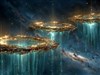
If you compare this one to your haunted mortuary wall, I think that you can see why the two are different and why the mortuary one is technically better (though still a bit crowded to be a very usable wall). I this one, you have realistic elements put together with very fake looking elements. There isn't a continued feel to them, and so it becomes obvious that there is a lot of clipart thrown together. The mortuary is much closer to feeling like it's all the same source.
Comment #25 Sunday, October 27, 2013 2:52 AM
Love this one
Please login to comment and/or vote for this skin.
Welcome Guest! Please take the time to register with us.
There are many great features available to you once you register, including:
- Richer content, access to many features that are disabled for guests like commenting on the forums and downloading files.
- Access to a great community, with a massive database of many, many areas of interest.
- Access to contests & subscription offers like exclusive emails.
- It's simple, and FREE!
|
|
Page 2 of 2 | |
|
|---|





Comment #21 Monday, October 25, 2010 2:39 PM
We all have room for improvement...I've moved on to 3d work in addition to the PS work...its HARD! but satisfying and the results are incredible.
The halo removal techniques are something you can find in advanced selection tutorials...but if you are working from scratch you wont have any to deal with anyways.
This image here really dosnt have any bad halos I was speaking more in general of all the compositional work.You have actually improved quite a lot in that area.
The one area you are still having problems with in my view are with your choices of elements to put in.
First,they just are not good elements to start with...they remind me of school holiday decorations.Fine I suppose if you just want to turn out some simple light hearted fun graphics...not my thing tho.
2nd is a technical thing and not my opinion...here its the jack o lantern...it was way too low a resolution to use here...you could have painted a better one yourself I bet.
And yes Colorado is fabulous neighbor...I moved here about 6 years ago from Texas and I may never go back.