








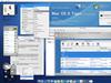








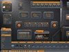
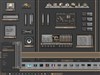
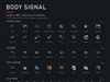

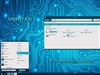




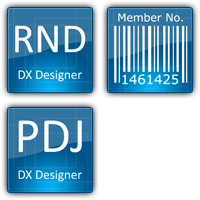







Here's a look at Higher Resolution Vista Icons
Wednesday, September 7, 2005 by 47songs | Discussion: WinCustomize Talk
Here's a closer look at some of the new higher resolution Vista Icons still in beta. Click on each icon to see a larger view. Apparently, they still need some tweaking, but this is the basic overall look to them.
They're not bad. Not spectacular, but not bad!
http://vista-icon-editor.com/browse-vista-icons/
They're not bad. Not spectacular, but not bad!
http://vista-icon-editor.com/browse-vista-icons/
CerebroJD
Reply #2 Wednesday, September 7, 2005 5:21 PM

Reply #2 Wednesday, September 7, 2005 5:21 PM
Wow... these are quite nice! I'm glad MS is finally making an effort to make a visually appealing OS. 

47songs
Reply #3 Wednesday, September 7, 2005 5:39 PM
Reply #3 Wednesday, September 7, 2005 5:39 PM
I noticed that icon and wondered the same thing, aimzzz. 


thomassen
Reply #5 Thursday, September 8, 2005 11:12 AM

Reply #5 Thursday, September 8, 2005 11:12 AM
Wasn't Longhorn... ...erhm... Vista's UI suppose to be vector powered? Including icons?
Tarkus
Reply #6 Thursday, September 8, 2005 3:42 PM

Reply #6 Thursday, September 8, 2005 3:42 PM
Those are some great icons! That would be an IP package I'd use, regardless of whether or not it has a Vista connection.
RPGFX
Reply #7 Thursday, September 8, 2005 4:02 PM

Reply #7 Thursday, September 8, 2005 4:02 PM
I especially like the printer icons... they are so slick..
Please login to comment and/or vote for this skin.
Welcome Guest! Please take the time to register with us.
There are many great features available to you once you register, including:
- Richer content, access to many features that are disabled for guests like commenting on the forums and downloading skins.
- Access to a great community, with a massive database of many, many areas of interest.
- Access to contests & subscription offers like exclusive emails.
- It's simple, and FREE!
Reply #1 Wednesday, September 7, 2005 4:51 PM
re icons: I like the ones here better. This one is familiar, though... #71-- 3rd from bottom on the left:
Is it ripped, or is the Dx icon a variation on an old theme?