






























Kindna disappointed :-/
Thursday, October 16, 2003 by Z06Leonhart | Discussion: WinCustomize Talk
https://www.wincustomize.com/skins.asp?library=1&SkinID=3595
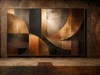
Can someone tell me what's wrong with this skin, i expected more from it than Aqualistic. I even thought(started) to make a suit base of this skin. But some how....
is the colours too bright?
not good colors combination?
the glass effect looks fake?
the buttons don't match with the skin?
Im just trying to get idea to make a better skin.
Please help me
Can someone tell me what's wrong with this skin, i expected more from it than Aqualistic. I even thought(started) to make a suit base of this skin. But some how....
is the colours too bright?
not good colors combination?
the glass effect looks fake?
the buttons don't match with the skin?
Im just trying to get idea to make a better skin.
Please help me

I.R. Brainiac
Reply #2 Thursday, October 16, 2003 9:30 PM

Reply #2 Thursday, October 16, 2003 9:30 PM
There's nothing really wrong with it.The colors were bright for me but I'm light sensitive andlots of people like light skins.A few contrasting or complimentary colors would be nice.(but thats just my preference)
Overall I thought it was very good skin,I gave it a 7
Overall I thought it was very good skin,I gave it a 7

Apocalypse_67
Reply #4 Thursday, October 16, 2003 10:04 PM

Reply #4 Thursday, October 16, 2003 10:04 PM
I agree with Bones and the slightely late IR 
The skin is good, simple but very smooth.
A darker shade of gradiant around the buttons will accent the glass effect.
A good tip when taking a screenshot is to show more skined windows eg. explorer, drop menu, control panel, etc. A little darker wallpaper would also bring out the windows. (Its a good eye catching trick )
)

The skin is good, simple but very smooth.
A darker shade of gradiant around the buttons will accent the glass effect.
A good tip when taking a screenshot is to show more skined windows eg. explorer, drop menu, control panel, etc. A little darker wallpaper would also bring out the windows. (Its a good eye catching trick
 )
)
Z06Leonhart
Reply #5 Thursday, October 16, 2003 10:09 PM
Reply #5 Thursday, October 16, 2003 10:09 PM
Thanks everyone, these are wonderful tips.  everything here is going to be in my next update and skin.
 everything here is going to be in my next update and skin.
Koasati
Reply #6 Thursday, October 16, 2003 10:19 PM

Reply #6 Thursday, October 16, 2003 10:19 PM
Yep, very clean skin, but as everyone has said, it needs a bit of contrast.


mormegil
Reply #7 Thursday, October 16, 2003 10:37 PM

Reply #7 Thursday, October 16, 2003 10:37 PM
the only suggestion I would make is that the glass effect has no edges, you have it running right to the ends of the objects. This makes it look more like a gradient then a glare, if you look at aqua, or any of the really glossy themes, it helps if there is a bit of a bull nose on the glare, a tiny bit more contrast. would help here. but not lighter anywhere. It very nice over all though.
Z06Leonhart
Reply #8 Friday, October 17, 2003 12:13 AM
Reply #8 Friday, October 17, 2003 12:13 AM
thanks mormegil but can you tell me the best way to make the edges i could do fine with round edges. Can you show me some tutorial because im very bad at shadow and edges. When I try to give it and edge like you said, the glass effect look worst and I no idea how to change the glass effect to make it look better. 

Blue Lightning - UzzEE
Reply #9 Friday, October 17, 2003 12:36 AM
Reply #9 Friday, October 17, 2003 12:36 AM
Well, what I Personaly think is that the colors are 2 bright.
themorphium
Reply #10 Friday, October 17, 2003 8:53 AM
Reply #10 Friday, October 17, 2003 8:53 AM
I think that teh skin is nice as it is. But it's impossible to tell whether people masses will like this skin or not. I have made some skins, which were, i think, nice. They got
Stupid me.
themorphium smacks head on table because again my connection glitches and lags
Stupid me.
themorphium smacks head on table because again my connection glitches and lags

mormegil
Reply #11 Friday, October 17, 2003 10:53 AM
Reply #11 Friday, October 17, 2003 10:53 AM
Someone posted some links to tutorials on doing glossy stuff, a bit ago. Look down the board a bit. I think its there somewere.
Dianekk
Reply #12 Friday, October 17, 2003 8:42 PM
Reply #12 Friday, October 17, 2003 8:42 PM
You know, everyone has different taste. Some people like the glassy types, some like the skins like Rube (which I love) and some like something totally different like Hot One (not sure if that is the name)or Fathom, which is a gorgeous skin. There are thousands of people downloading skins on WB and it is hard to say what is wrong or right with one or the other. I have such a conglomeration of WB skins to fit my moods. I think the skin is nice, but there are a lot of skins like it out there so I probably would not download it because I have something similar. If I was just starting at WC, I probably would download it.
Z06Leonhart
Reply #13 Saturday, October 18, 2003 10:34 AM
Reply #13 Saturday, October 18, 2003 10:34 AM
Thanks Morphium and Dianekk, ya really make me feel better
Please login to comment and/or vote for this skin.
Welcome Guest! Please take the time to register with us.
There are many great features available to you once you register, including:
- Richer content, access to many features that are disabled for guests like commenting on the forums and downloading skins.
- Access to a great community, with a massive database of many, many areas of interest.
- Access to contests & subscription offers like exclusive emails.
- It's simple, and FREE!
Reply #1 Thursday, October 16, 2003 9:30 PM
if you want that good glassy or plastic look, use a darker color underneath the glass layer, it shows up better ie, Doublet by Duopixels or Copperdeck2 by Treetog or Idemnity by Chad Ross (great examples)