



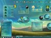










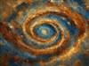















Ok I poured my heart into this wallpaper and....
Monday, September 15, 2003 by naitsirch79 | Discussion: WinCustomize Talk
I put up a wallpaper the other day, and I am assuming that it didn't make it because it is not in my uploads anymore. Although I dissagree with this. I would at least like to know whether it got denied or not. It is sort of just in limbo. Now, IMO it is pretty nice work and would be an excellent wallpaper for someone.
This new submission I know is good so I would like to know exactly how this works and why my other submission might not have gotten accepted. I put many hours into my work so I can't keep making wallpaper designs if they aren't going to be used...

This new submission I know is good so I would like to know exactly how this works and why my other submission might not have gotten accepted. I put many hours into my work so I can't keep making wallpaper designs if they aren't going to be used...

 |
|
Page 2 of 7 | |
|
|---|

naitsirch79
Reply #23 Monday, September 15, 2003 8:45 PM
^^^^^^^^^^^^
HUH? They are both great artist? aren't they?
Reply #23 Monday, September 15, 2003 8:45 PM
| Comparing Van gough and Monet is like comparing naitsrck79 and Jario. |
^^^^^^^^^^^^
HUH? They are both great artist? aren't they?
Sugaree
Reply #24 Monday, September 15, 2003 8:57 PM

Reply #24 Monday, September 15, 2003 8:57 PM
maybe if you got rid of the white flars along with the text....
It's not bad thou
It's not bad thou


Jafo
Reply #27 Monday, September 15, 2003 9:11 PM

Reply #27 Monday, September 15, 2003 9:11 PM
naitsirch79....2 things, and please heed them well....at no time did I mention the phrase 'rip off'.....kindly refrain from misquoting me [or anyone]....and also 'obvious lack of artistry skills' is an inappropriate comment upon a third party and fellow site member/contributor.
This is exactly why public commentary is not advisable, and further comment/s of that ilk will force a thread closure.
Aqua.
Reply #28 Monday, September 15, 2003 9:11 PM
Reply #28 Monday, September 15, 2003 9:11 PM
You asked....
1) The text
2) The signature (just use a cool font in the future)
3) The lime green background
4) The stem
And the aquaify effect just doesn't look as good with pumpkins as it does with small fruits and berries.
Maybe try a basket of blueberries next time?

1) The text
2) The signature (just use a cool font in the future)
3) The lime green background
4) The stem
And the aquaify effect just doesn't look as good with pumpkins as it does with small fruits and berries.
Maybe try a basket of blueberries next time?

EventHorizon
Reply #29 Monday, September 15, 2003 9:15 PM
I was being sarcastic... I think it was rather pathetic of you to put down Jarios work while exalting your own. And also comapring Yourself to Monet or Van Gogh didnt give a good impression either. Yes maybe Jario didint do his pics free-hand, but ppl dont care HOW you do it so much as what the final product is.
On a lighter note, your pic could use a little editing but really isnt too bad.
Reply #29 Monday, September 15, 2003 9:15 PM
| HUH? They are both great artist? aren't they? |
I was being sarcastic... I think it was rather pathetic of you to put down Jarios work while exalting your own. And also comapring Yourself to Monet or Van Gogh didnt give a good impression either. Yes maybe Jario didint do his pics free-hand, but ppl dont care HOW you do it so much as what the final product is.

On a lighter note, your pic could use a little editing but really isnt too bad.


horiz0n
Reply #33 Monday, September 15, 2003 9:37 PM

Reply #33 Monday, September 15, 2003 9:37 PM
Ok, first problem is the text, and it's not that you have text, but it serves no purpose. The text looks like hell to begin with, the way it's all warped serves no purpose, plus the size, color, etc.. makes it look like you just threw it together.
Beyond that it says "the magic pumpikin" when in fact it's "pumpkin" there is no magic to it, so the word magic has no place in it. my advice is to perhaps go to a college or some other place where you can take classes and take typography.
The green you are using is more of a lime green and given that it's a pumpkin would be better suited with a dark autumn green or harvest green.
The spots on it seem to serve no apparent purpose either. (are they snow, dandruff, tinkerbells or what?)
This doesn't look like glass because it's not transparent and nothing is refracting, but just looks glossy, if it is glossy then your highlight would look much like it does, but your shadow on the bottom right would not be as smooth of a transition and anti aliased as that, and would be quicker changing shifts of light.
The water drops don't serve any purpose either as there also is no apparent reason as to why they are there, if the spots were snow then the water would freeze, if it was wet it wouldn't just have a few drops falling off of it, it looks like it's crying or leaking.
The top of the stem looks all wrong with that shadow, especially if it's gonna be glossy too you need highlights on the other side of it, I think it would be better to leave the shadow on the stem off altogether.
any other questions?
Beyond that it says "the magic pumpikin" when in fact it's "pumpkin" there is no magic to it, so the word magic has no place in it. my advice is to perhaps go to a college or some other place where you can take classes and take typography.
The green you are using is more of a lime green and given that it's a pumpkin would be better suited with a dark autumn green or harvest green.
The spots on it seem to serve no apparent purpose either. (are they snow, dandruff, tinkerbells or what?)
This doesn't look like glass because it's not transparent and nothing is refracting, but just looks glossy, if it is glossy then your highlight would look much like it does, but your shadow on the bottom right would not be as smooth of a transition and anti aliased as that, and would be quicker changing shifts of light.
The water drops don't serve any purpose either as there also is no apparent reason as to why they are there, if the spots were snow then the water would freeze, if it was wet it wouldn't just have a few drops falling off of it, it looks like it's crying or leaking.
The top of the stem looks all wrong with that shadow, especially if it's gonna be glossy too you need highlights on the other side of it, I think it would be better to leave the shadow on the stem off altogether.
any other questions?
IPlural
Reply #35 Monday, September 15, 2003 9:44 PM

Reply #35 Monday, September 15, 2003 9:44 PM
OK, I'll dangle my toe in the water...
naitsirch, I'd look to painting a patch *pumpkin* and or leaning to the more realistic. As far as the look goes, I can produce anything you like at anytime with Photoshop and different Styles both Layer/Text and Object which will look as good or better than most Aqua, Candy, Glass, Plastic style you like.
Adobe Exchange has loads of them if you can not create the Styles yourself. Make a shape, any color you like and click a style and bingo you've got the deed done.
I am not trying to take anything away from anyone, and the icon work that comes from some of the people here and on the web is fantastic and I love it. But if you can draw and or paint, don't cover it up with affects and let your style be submitted and accepted on the merits of your abilities.
Also, private is key to this type of question because you do not put people on the spot and they in turn do not have to face popping anyones ego, feelings, ambition, etc...
You know, looking at it...
You could take and shrink it down to say 250x350 (the pumpkin) and get ride of the extra stuff, do it as line art with a fading glow to black starting at say orange and out to yellow into black, say about 15 pixels out from center, make the center orange/red, lay a light fog of purple over that, do some typography design and affects on that(those) layer(s), do some edge work coming out of one of the lower corners that is like a dark scroll work(the vines) where you can just make them out, but only make them reach about 1/5th up the side and bottom edge toward top and the other side. Then on the top opposite side do the same thing and make them the same size leafs and vine diameters but make them reach twice to three times as far and take the top all the way across and drop it over the edge like it is hanging inside a window frame. Then put together or hunt up some icons, do some objectbars for it and your good to go for Hallow Weenie
Or just a Wall that others can add to something they are working on.
anyway, just kicking ideas is all..
naitsirch, I'd look to painting a patch *pumpkin* and or leaning to the more realistic. As far as the look goes, I can produce anything you like at anytime with Photoshop and different Styles both Layer/Text and Object which will look as good or better than most Aqua, Candy, Glass, Plastic style you like.
Adobe Exchange has loads of them if you can not create the Styles yourself. Make a shape, any color you like and click a style and bingo you've got the deed done.
I am not trying to take anything away from anyone, and the icon work that comes from some of the people here and on the web is fantastic and I love it. But if you can draw and or paint, don't cover it up with affects and let your style be submitted and accepted on the merits of your abilities.
Also, private is key to this type of question because you do not put people on the spot and they in turn do not have to face popping anyones ego, feelings, ambition, etc...
You know, looking at it...
You could take and shrink it down to say 250x350 (the pumpkin) and get ride of the extra stuff, do it as line art with a fading glow to black starting at say orange and out to yellow into black, say about 15 pixels out from center, make the center orange/red, lay a light fog of purple over that, do some typography design and affects on that(those) layer(s), do some edge work coming out of one of the lower corners that is like a dark scroll work(the vines) where you can just make them out, but only make them reach about 1/5th up the side and bottom edge toward top and the other side. Then on the top opposite side do the same thing and make them the same size leafs and vine diameters but make them reach twice to three times as far and take the top all the way across and drop it over the edge like it is hanging inside a window frame. Then put together or hunt up some icons, do some objectbars for it and your good to go for Hallow Weenie
Or just a Wall that others can add to something they are working on.
anyway, just kicking ideas is all..
horiz0n
Reply #36 Monday, September 15, 2003 9:44 PM
Reply #36 Monday, September 15, 2003 9:44 PM
On a side note, you may be right that jairo is not the best artist, however you said and I'll quote "when using free hand you can tell his obvious lack of artistry skills". That is "bs" and if you compare work between the two of you, it's easy to see a difference in skills, and he doesn't use freehand btw, he uses corel draw and photoshop. And to quote you again with the "My rain could even help his(jairo's)pictures a bit and I would be glad to give him the recipe". I don't believe Jairo needs much assistance and that rain of yours didn't help your work, why would it help his.
btw why isn't this thread locked yet lol
btw why isn't this thread locked yet lol
horiz0n
Reply #38 Monday, September 15, 2003 9:47 PM
Reply #38 Monday, September 15, 2003 9:47 PM
btw i'm not insulting you, just giving constructive critisism, and thats something artist's need to get used to, they need to develop thick skin and learn from mistakes. Bottom line is that this piece needs more work.
horiz0n
Reply #39 Monday, September 15, 2003 9:53 PM
Reply #39 Monday, September 15, 2003 9:53 PM
I think this would be fine to post on here, but not as is, believe that this wall could stand to have a little more soul pored in it first. Would like to see it after more work is done, improvements made, and suggestions listened to.
Peff
Reply #40 Monday, September 15, 2003 9:54 PM
Reply #40 Monday, September 15, 2003 9:54 PM
Sounded pretty insulting to me, horiz0n. (as opposed to IPlural, whose comments were indeed constructive)
Please login to comment and/or vote for this skin.
Welcome Guest! Please take the time to register with us.
There are many great features available to you once you register, including:
- Richer content, access to many features that are disabled for guests like commenting on the forums and downloading skins.
- Access to a great community, with a massive database of many, many areas of interest.
- Access to contests & subscription offers like exclusive emails.
- It's simple, and FREE!
|
|
Page 2 of 7 | |
|
|---|
Reply #21 Monday, September 15, 2003 8:43 PM