

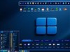

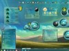

























Might I interest you in a WB beta test?
Tuesday, June 3, 2003 by Angel_Wings | Discussion: WinCustomize Talk
System requirements:
WIN XP
WB 4.0
Mental requirements:
Patience (he-he)
A love for the colors of Maroon & Peach (LMAO)! Okay, ya can hate 'em!
Ahhhhhhhhhh. Anyway if there are any takers the beta WB is at: http://www.darkseraphim.com/PassionBETA.wba
Feel free to rag on it...I know it still needs work.

WIN XP
WB 4.0
Mental requirements:
Patience (he-he)
A love for the colors of Maroon & Peach (LMAO)! Okay, ya can hate 'em!

Ahhhhhhhhhh. Anyway if there are any takers the beta WB is at: http://www.darkseraphim.com/PassionBETA.wba
Feel free to rag on it...I know it still needs work.

 |
|
Page 1 of 2 | |
|
|---|
IPlural
Reply #2 Tuesday, June 3, 2003 8:27 PM

Reply #2 Tuesday, June 3, 2003 8:27 PM
I DL'd it and will load it up later. I did take a look at it in the Windoblinds skin browser/frontend and it looks nice, my wife will love the colours for sure 
Have some feedback later tonight or early morning ESTime

Have some feedback later tonight or early morning ESTime
Hus
Reply #4 Tuesday, June 3, 2003 8:36 PM

Reply #4 Tuesday, June 3, 2003 8:36 PM
It's not THAT girly, Shmoopy, I dig the flames in the start menu! 

eieio
Reply #6 Tuesday, June 3, 2003 8:38 PM

Reply #6 Tuesday, June 3, 2003 8:38 PM
very nice concept Shmoopy!
Personally I find the shadow on the Titlebar text a little distracting (hard to read) but I like the colors and the menubackgrounds. Just personal preference but I'd probably do away with the system icon.
Overall, it's very good.
Personally I find the shadow on the Titlebar text a little distracting (hard to read) but I like the colors and the menubackgrounds. Just personal preference but I'd probably do away with the system icon.
Overall, it's very good.

Angel_Wings
Reply #7 Tuesday, June 3, 2003 8:42 PM
Reply #7 Tuesday, June 3, 2003 8:42 PM
Thank you pictoratus! System icon? Oh on the window bar? I guess I like seeing the icon for folder etc. there but it is pretty skinny.
Ahhh. The shadow needs to be a few shades lighter...that way the effect is in tact but not intrusive. Great tip, pic! *SMOOCHES*
Ahhh. The shadow needs to be a few shades lighter...that way the effect is in tact but not intrusive. Great tip, pic! *SMOOCHES*
Angel_Wings
Reply #8 Tuesday, June 3, 2003 8:44 PM
Reply #8 Tuesday, June 3, 2003 8:44 PM
You are so right too, pic...
it is distracting!hehe
See? This is what I love is when I get skinners giving me help and ideas and a critique!
It is MOST 'awesome dude', she says in Vally-Girl Speak...hehe
it is distracting!hehe
See? This is what I love is when I get skinners giving me help and ideas and a critique!
It is MOST 'awesome dude', she says in Vally-Girl Speak...hehe

Iben
Reply #9 Tuesday, June 3, 2003 8:49 PM

Reply #9 Tuesday, June 3, 2003 8:49 PM
I like it. The skin seems to work good. I would like to see a mouse over change in the button shape or brightness ,main windows top left,like on documents window buttons file ,view,edit,etc.All so if the task manager could some how have more then one background color built into it,for contrast.The before mentioned would also effect other windows like file properties windows.I like the window frames.I like the parts I did not mention as they are.
Well you asked.
Thats my honest opinion.
Well you asked.
Thats my honest opinion.
Angel_Wings
Reply #10 Tuesday, June 3, 2003 8:57 PM
Reply #10 Tuesday, June 3, 2003 8:57 PM
Your opinion is indeed valuable, Iben! All input is valuable! 

All input is valuable! 

Angel_Wings
Reply #11 Tuesday, June 3, 2003 8:58 PM
Reply #11 Tuesday, June 3, 2003 8:58 PM
And THANKY YOU for looking! (forgot that part...forgive me?)
Angel_Wings
Reply #12 Tuesday, June 3, 2003 9:02 PM
Reply #12 Tuesday, June 3, 2003 9:02 PM
Well, miss Shmoops is hittin' the hay early so any other ideas ya got to make my skin better just holler it here and I'll be glad to take a looksee cuz damn...ain't it great when we can help each other? HUH?
Thank you so much and before I head off to zzz's land...
(((HUGS)))
Miss Shmoopy aka AngEla
Thank you so much and before I head off to zzz's land...
(((HUGS)))
Miss Shmoopy aka AngEla
deleted
Reply #13 Tuesday, June 3, 2003 10:56 PM

Reply #13 Tuesday, June 3, 2003 10:56 PM
Hey looks pretty good. I must admit that I am a fan of simple skins, and personally not a huge fan of your other skins (a little too busy for my liking), but I'm liking this one a WHOLE lot.
Lecrayon
Reply #16 Wednesday, June 4, 2003 6:17 AM
Reply #16 Wednesday, June 4, 2003 6:17 AM
AAAAaaaaaaaaaargh

Can't stop playing with the dancing buttons tehe..
The titlebar Font is probably better readable if it has no offset shadow.
I am hooked on this one. You are improving your skills very quick!

Can't stop playing with the dancing buttons tehe..
The titlebar Font is probably better readable if it has no offset shadow.
I am hooked on this one. You are improving your skills very quick!
Doreen
Reply #17 Wednesday, June 4, 2003 6:28 AM

Reply #17 Wednesday, June 4, 2003 6:28 AM
Angela this is great alil too pinky for my taste (me is picky when it comes to certain colors of pink) but the detail & work you put into this is great!
nice job on the mouse over on the small buttons they are neat the way they lift up (soft decent ani)
only suggestion is on the bigger buttons on the "toolbar" you might want to make them have a mouse over image such as the select button to match the title bar & smaller buttons maybe?
but overall you did great!
Doreen runs back to the Toony WB, I can't live w/o it!
nice job on the mouse over on the small buttons they are neat the way they lift up (soft decent ani)
only suggestion is on the bigger buttons on the "toolbar" you might want to make them have a mouse over image such as the select button to match the title bar & smaller buttons maybe?
but overall you did great!
Doreen runs back to the Toony WB, I can't live w/o it!
Lecrayon
Reply #18 Wednesday, June 4, 2003 6:45 AM
Reply #18 Wednesday, June 4, 2003 6:45 AM
Hmmmmmmmm...I would also get rid of the seperation lines in the startpanel.
Doreen
Reply #19 Wednesday, June 4, 2003 6:52 AM
Reply #19 Wednesday, June 4, 2003 6:52 AM
also I meant to say to listen to Lecrayon on that "Font Shadow" you should lose that, cuz it's unreadable for some reason...
Angel_Wings
Reply #20 Wednesday, June 4, 2003 12:14 PM
Reply #20 Wednesday, June 4, 2003 12:14 PM
Thank you for the input DavidMandle, Mr Cavanaugh, Doreen and LeCrayon
I'm gonna drop that drop-shadow on the titlebars then and yeah...those lines on the start-bar don't look right, LeCrayon...good eyes!
I really appreciate the help...my next skin will probably be gray just for a clean break from all of these colors I've been using.
I'm getting my new Dell computer delivered today...I'm about to bust! Woo hoo...new toy for Shmoooooooooooooooooopy!
Thank you again, folks! ((((HUG))))
I'm gonna drop that drop-shadow on the titlebars then and yeah...those lines on the start-bar don't look right, LeCrayon...good eyes!
I really appreciate the help...my next skin will probably be gray just for a clean break from all of these colors I've been using.
I'm getting my new Dell computer delivered today...I'm about to bust! Woo hoo...new toy for Shmoooooooooooooooooopy!
Thank you again, folks! ((((HUG))))
Please login to comment and/or vote for this skin.
Welcome Guest! Please take the time to register with us.
There are many great features available to you once you register, including:
- Richer content, access to many features that are disabled for guests like commenting on the forums and downloading skins.
- Access to a great community, with a massive database of many, many areas of interest.
- Access to contests & subscription offers like exclusive emails.
- It's simple, and FREE!
|
|
Page 1 of 2 | |
|
|---|
Reply #1 Tuesday, June 3, 2003 8:04 PM