






























Pimpin' my site redesign - Dangeruss Industries
Friday, January 31, 2003 by Dangeruss | Discussion: WinCustomize Talk
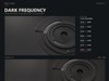
I dislike these type of posts, but I respect the opinions here, so I'm seeking some feedback. First off, the splash screen, stay or go? Some people really hate them, some folk don't care either way. It's not a fixture, so killing it is painless for me.
So... comments? bugs? Browser compatability issues? So far it's looking OK in IE, Opera, Mozilla and Safari, but I'm happy to hear from Chimera users or any other alternative browser users.
The focus of the site is my renewed interest in GUI design for software developers and technical / editorial illustration for hire. So by nature, the site is pretty commercial rather than artsy-fartsy-trendwhoreish.
 |
|
Page 1 of 2 | |
|
|---|
BoXXi
Reply #2 Friday, January 31, 2003 10:54 AM
Reply #2 Friday, January 31, 2003 10:54 AM
The site looks good Russ! Regarding the splash screen... I like it, but would actually prefer it without the photo. I think it would look cool with just the technical drawing that is underneath the photo, (Where it says "Design Technology"). Everything works real nice for me in IE6, very professional job. only got one error, a 404 on this page: http://www.dangeruss-industries.com/images/VTR1000R.jpg and I really wanted to look at that Honda too!
MikeB314
Reply #3 Friday, January 31, 2003 11:01 AM

Reply #3 Friday, January 31, 2003 11:01 AM
Oh my, Russ! That's a beautiful new look. You'll get nothing but compliments from me, so I'll spare you. As for the splash screen, I tend to avoid them unless there is particular information I want to get across before people enter the site. It really looks great though. You always inspire me to try harder. 


Weaksid
Reply #4 Friday, January 31, 2003 11:04 AM

Reply #4 Friday, January 31, 2003 11:04 AM
Sweet, very sweet. I would just like to know which program you used to design it Like Dreamweaver, etc?
Like Dreamweaver, etc?
Splash0453
Reply #5 Friday, January 31, 2003 11:07 AM
Reply #5 Friday, January 31, 2003 11:07 AM
I like the site, but there is something which I don't think looks quite right about it. The top, and the menu are cool, but under that it looks kinda disjointed, as if the site had a part of another inside of it or something. It jsut doesn't seem to fit together too well. But that's just my opinion....


c242
Reply #7 Friday, January 31, 2003 11:31 AM

Reply #7 Friday, January 31, 2003 11:31 AM
Visited it earlier today (as every day) and liked the changes. The only thing is that I would do the splash screen background color the same as the main site.
--Gabriel
Reply #8 Friday, January 31, 2003 12:12 PM

Reply #8 Friday, January 31, 2003 12:12 PM
Very nice...
the only thing I might change is the phone1.jpg, I would proboly make it like 80% opaque so it wouldn't be confused with the controls, and blends in a little more with the page. That's really just a matter of taste, but the site is VERY nicely designed.
the only thing I might change is the phone1.jpg, I would proboly make it like 80% opaque so it wouldn't be confused with the controls, and blends in a little more with the page. That's really just a matter of taste, but the site is VERY nicely designed.
Hell Dragon
Reply #9 Friday, January 31, 2003 2:43 PM
Reply #9 Friday, January 31, 2003 2:43 PM
First of all... great new look Russ; lookin' sweet 
Here are the bugs/issues that I found with the site.
1) When you go to the main page (i.e. homepage.htm) and click on the 'home' link at the top you get a 404 error. I'm not sure if other pages do this too; I didn't check them all.
2)Also, the text under the 'What is Dangeruss Industries' is a little hard to read because of the white scan-lines in the back. It should be possible to add a black drop shadow to the text through CSS and that would really clear up any problems.
3) Nothing big at all, but you could do with a space between copyright and 2002-2003 in the footer image.
4) FAQIcon.jpg on the dangeruss_stuff.htm page loads as a broken image for me.
5) In IE6 on XP in 800x600 resolution (a surprisingly common combination); you get a horizontal scrollbar for the site. Other higher resolutions display perfectly.
6) Regarding the splash screen... it looks great, but I would suggest making the entire image clickable (and not just the 'enter' text) since most surfers will be accustomed to clicking anywhere and since you have the text vertical some may just miss it and think the site isn't launched yet.
Personally, I would also lower the file size of the splash screen; at 81K it is quite hefty for modem users and could put them off.
I hope you found these useful Russ... I don't mean to pick at your site at all, just giving my honest suggestions & opinions.
Keep up the excellent work.
IPlural
Reply #10 Friday, January 31, 2003 3:04 PM

Reply #10 Friday, January 31, 2003 3:04 PM
Looks great
but what would one expect?
mmm, email find's and 404's ? or in here?
but what would one expect?
mmm, email find's and 404's ? or in here?
Old_Crab
Reply #11 Friday, January 31, 2003 3:04 PM

Reply #11 Friday, January 31, 2003 3:04 PM
Old Crab likes the site. You'll probably have some fiddley bits to finish. The splash screen - is a splash screen. I first clicked - nothing happened. Old doofus had to find and click on Enter to enter. D'oh. 

IPlural
Reply #12 Friday, January 31, 2003 3:10 PM
Reply #12 Friday, January 31, 2003 3:10 PM
guess in here,
"commercial" "VTR1000" 404
oh you nixed the Scorpin?
That is sweet too, one of the 3D's you did that I sat for a long time looking over while it inspired all kinds of creative thoughts on the topic of robotics.
"commercial" "VTR1000" 404
oh you nixed the Scorpin?
That is sweet too, one of the 3D's you did that I sat for a long time looking over while it inspired all kinds of creative thoughts on the topic of robotics.
Jafo
Reply #13 Friday, January 31, 2003 7:17 PM

Reply #13 Friday, January 31, 2003 7:17 PM
Russ...the 'Affiliates' buttons need to be spaced to seperately define them [x-axis].
I'm never a fan of 'white' as a background for text....too glary..and incidentally the main reason I rarely go to skinz.org.
Other than that, as pretty as an MV Agusta....
I'm never a fan of 'white' as a background for text....too glary..and incidentally the main reason I rarely go to skinz.org.
Other than that, as pretty as an MV Agusta....
Dangeruss
Reply #14 Friday, January 31, 2003 8:03 PM
Reply #14 Friday, January 31, 2003 8:03 PM
Thanks for all the feedback - I'll address the issues with 404's and stuff ASAP (after dinner) Thanks again!
Thanks again!
Dangeruss
Reply #15 Friday, January 31, 2003 8:23 PM
Reply #15 Friday, January 31, 2003 8:23 PM
OK Many bugs squashed and suggesteions implemented (almost all - thanks guys)
Q&A section and comments addressed:
The scorpion wallpaper image is on Wallpapers page 2 the model is in the resources section.
I used... Photoshop, Texturizer (text editor) and Frontpage 2002 - (Audience gasps). I know Dreamweaver is probably a much better app, but I've grown accustomed to FP's quirks. That and DW is still damned expensive. I resist the warez demons, so that's not an option in my book.
Sorry JAFO, the white's gonna stay. Well for know anyway. You'd br proud of me though, one of the designs I was playing with was multi shades of grey.
Jafo
Reply #16 Friday, January 31, 2003 8:33 PM
Reply #16 Friday, January 31, 2003 8:33 PM
Russ....'shades of grey'....there's hope for you yet...
IPlural
Reply #17 Friday, January 31, 2003 8:58 PM
food?
you mean your allowed to eat and not pixel fiddle 24/7?
someone needs to talk with higher higher about this development ....
Reply #17 Friday, January 31, 2003 8:58 PM
food?
you mean your allowed to eat and not pixel fiddle 24/7?
someone needs to talk with higher higher about this development ....
elvee
Reply #18 Friday, January 31, 2003 9:23 PM

Reply #18 Friday, January 31, 2003 9:23 PM
Hi Russ, Your new design looks great except the Splash, maybe if you had something else besides the photo, just my opinion. Great Job! 

SuperheroCanadian
Reply #19 Friday, January 31, 2003 9:46 PM

Reply #19 Friday, January 31, 2003 9:46 PM
i like the site love it actually, for th splash though try darkening the backround, and converting all text on the page to the same font/ pic the text ooks kinda outta place with the splash
kthxbye
Reply #20 Friday, January 31, 2003 10:24 PM
Reply #20 Friday, January 31, 2003 10:24 PM
Personally Russ - I /love/ the splash - and this is from someone who loathes them! 
Hrm... The section of text underneath the "What is Dangeruss Industries?" graphic - the text which begins 'Dangeruss Industries.com
is an art resource company run...' doesn't fit properly when my font settings are set to 'large' or 'larger' - maybe it might be good to set an explicit font size for that part of the text?
Not everyone keeps their browser text setting on medium or smaller after all.
(Couldn't even look at it in Opera 7 - it's decided it's going to crash on me the second I bring it up tonight. Typical.)
Please login to comment and/or vote for this skin.
Welcome Guest! Please take the time to register with us.
There are many great features available to you once you register, including:
- Richer content, access to many features that are disabled for guests like commenting on the forums and downloading skins.
- Access to a great community, with a massive database of many, many areas of interest.
- Access to contests & subscription offers like exclusive emails.
- It's simple, and FREE!
|
|
Page 1 of 2 | |
|
|---|
Reply #1 Friday, January 31, 2003 10:39 AM
Http://www.dangeruss-industries.com