





























I love to say this
Monday, August 26, 2002 by Boza | Discussion: WinCustomize Talk
My wallpaper was rejected... 
(some of you are laughing right now... )
)
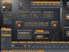
But I'd like you to see it anyway!
So her's a link to it! http://w1.468.telia.com/~u46803016/nova.zip

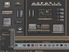
I was thinking about adding more detail to it, but after switching to a more detailed wallpaper, I had a hard time finding all my icons. I've got like 100 icons on my desktop.
So this is the final result! Not bad I think... I used GIMP
What do you think?

(some of you are laughing right now...
 )
)But I'd like you to see it anyway!

So her's a link to it! http://w1.468.telia.com/~u46803016/nova.zip


I was thinking about adding more detail to it, but after switching to a more detailed wallpaper, I had a hard time finding all my icons. I've got like 100 icons on my desktop.
So this is the final result! Not bad I think... I used GIMP

What do you think?
Boza
Reply #2 Monday, August 26, 2002 12:05 PM
Reply #2 Monday, August 26, 2002 12:05 PM
*mumble*
All right!
http://w1.468.telia.com/~u46803016/nova-1024.jpg
All right!

http://w1.468.telia.com/~u46803016/nova-1024.jpg
Frogboy
Reply #3 Monday, August 26, 2002 12:37 PM

Reply #3 Monday, August 26, 2002 12:37 PM
Pretty good picture. I'm not an artist so I can't comment on to its artistical merits.


goodmorphing
Reply #6 Monday, August 26, 2002 2:57 PM

Reply #6 Monday, August 26, 2002 2:57 PM
I love to see this thread! Hi Boza, thanks for sharing your picture.
Hi Boza, thanks for sharing your picture.
voo
Reply #7 Monday, August 26, 2002 3:02 PM

Reply #7 Monday, August 26, 2002 3:02 PM
wonder if it was because picture seems a bit sore on the eyes, i know it is with me with black background
still nice wall
still nice wall
bakerstreet
Reply #8 Monday, August 26, 2002 3:18 PM

Reply #8 Monday, August 26, 2002 3:18 PM
Not a bad picture at all. I'm not sure that it is fleshed-out enough, if you get my meaning. You see so much stuff like this that it takes some thought to make it distictive. Think beyond 'effects', and more on what you are actually protraying. Give it something concrete. All opinions, take them as such. Keep up the good work.
Orion
Reply #10 Monday, August 26, 2002 3:31 PM

Reply #10 Monday, August 26, 2002 3:31 PM
IMO it's better than half the crap they accepted.
Keep it up.
Keep it up.
Kinrik
Reply #11 Monday, August 26, 2002 4:07 PM
Reply #11 Monday, August 26, 2002 4:07 PM
hey, that's pretty sweet, me thinks...
especially since it is in GIMP, which I am STILL trying to figure out...
especially since it is in GIMP, which I am STILL trying to figure out...

joetheblow
Reply #12 Monday, August 26, 2002 4:32 PM

Reply #12 Monday, August 26, 2002 4:32 PM
not bad. I think it is a little bright but, not bad. Not sure if its because the screen shot is a small picture of the original but it looks really pixelated. That could be it.
and what is the size? 1024x768? any smaller than that would not be good.
and what is the size? 1024x768? any smaller than that would not be good.
1Renegade
Reply #13 Monday, August 26, 2002 6:47 PM

Reply #13 Monday, August 26, 2002 6:47 PM
Nice one, Boza. Hang in there, I am not familiar with the "criteria" for "acceptance" ...... but as a fellow GIMP user, you can't be all that "bad."
WOM
Reply #14 Monday, August 26, 2002 6:54 PM

Reply #14 Monday, August 26, 2002 6:54 PM
I think I looks good and it's better than some that have been uploaded IMHO.
elvee
Reply #15 Monday, August 26, 2002 7:13 PM

Reply #15 Monday, August 26, 2002 7:13 PM
I agree, i think it is pretty good, only thing though it gets very distracting. Maybe you could Tone down the brightness, or lighten up the dark areas. It is not bad IMHO but i couldn't use it everyday.
kith
Reply #16 Monday, August 26, 2002 8:52 PM
Reply #16 Monday, August 26, 2002 8:52 PM
It is a very cool piece of artwork, and I can't say I remember seeing anything like it. However I would probably never use it as wallpaper. While the lighting effect is nicely done it would probably give me a headache looking at it all day. I can say though it does seem to be of higher quality construction than a lot of stuff in the library. But most of the poorer qaulity stuff looks as if it was made to be wallpaper, which is probably why it made it in.
Keep hitting the moderators with your work. It will get in...
Keep hitting the moderators with your work. It will get in...
Jafo
Reply #17 Monday, August 26, 2002 9:36 PM

Reply #17 Monday, August 26, 2002 9:36 PM
There are many ways that a work submitted as a wallpaper can strike the problem of 'getting past the moderators'.
One good example is/can be how confrontational it is as a wall to be looked-at all day.
As a skinner who works often pixel by pixel....getting up close and personal with one's monitor really demands relatively low-impact graphics....[hence my fetish for grey]...high-contrasted and overly 'bright' walls will rarely survive the 'gee-whizz' period of 'it's kewl cos it's new', but people will tend to revert to something a little more 'comfortable'.
Now, that doesn't mean it's gotta be 'bland', dull and boring.....but were it to be wildly harsh and distracting, approval 'could' be forth-coming if it also displayed intricacies of detail...via layers and depth of perception [what usually causes 'space' walls to miss the cut...[the lack-of]].
Then there's 'clarity'...a clean, large wall can be reduced to suit people's screens, but an 'OK' small one will tend to suffer when enlarged.
If a wall is just too busy, and icons are lost...it's a 'busy artwork' but a failure as a functional work space.
No 'room' for icon/proggy shortcut placement? Probably results in an untidy wall/desktop, too.
Often, with 3D renders/graphics...even light-sources can be distracting if clearly 'wrong'.
Traditional Windows source is from the top-left of screen...[I guess the coders were all right-handed]...if you deviate from that then a source of illumination would need to be 'implied'. Remember....a 'little' mistake is usually just that, but a really BIG one could be argued as intentional...
These are just a few thoughts on walls as walls [not as 'art']....and fortunately there's a number of Admins keeping an eye on wall submissions or else only the grey ones would get in...[oh, and the gray ones too].
[actually, I'm not that one-eyed....just don't get me started about Dolphins....and lens-flares....and Blue swirlies....and giant lettering proclaiming "WWW.MY-SITE-R0X0Rs.com"....or Britney's boobs...or....]...
One good example is/can be how confrontational it is as a wall to be looked-at all day.
As a skinner who works often pixel by pixel....getting up close and personal with one's monitor really demands relatively low-impact graphics....[hence my fetish for grey]...high-contrasted and overly 'bright' walls will rarely survive the 'gee-whizz' period of 'it's kewl cos it's new', but people will tend to revert to something a little more 'comfortable'.
Now, that doesn't mean it's gotta be 'bland', dull and boring.....but were it to be wildly harsh and distracting, approval 'could' be forth-coming if it also displayed intricacies of detail...via layers and depth of perception [what usually causes 'space' walls to miss the cut...[the lack-of]].
Then there's 'clarity'...a clean, large wall can be reduced to suit people's screens, but an 'OK' small one will tend to suffer when enlarged.
If a wall is just too busy, and icons are lost...it's a 'busy artwork' but a failure as a functional work space.
No 'room' for icon/proggy shortcut placement? Probably results in an untidy wall/desktop, too.
Often, with 3D renders/graphics...even light-sources can be distracting if clearly 'wrong'.
Traditional Windows source is from the top-left of screen...[I guess the coders were all right-handed]...if you deviate from that then a source of illumination would need to be 'implied'. Remember....a 'little' mistake is usually just that, but a really BIG one could be argued as intentional...

These are just a few thoughts on walls as walls [not as 'art']....and fortunately there's a number of Admins keeping an eye on wall submissions or else only the grey ones would get in...[oh, and the gray ones too].
[actually, I'm not that one-eyed....just don't get me started about Dolphins....and lens-flares....and Blue swirlies....and giant lettering proclaiming "WWW.MY-SITE-R0X0Rs.com"....or Britney's boobs...or....]...
WOM
Reply #18 Monday, August 26, 2002 9:42 PM
Reply #18 Monday, August 26, 2002 9:42 PM
Boza- try making it a logon. It would work there. It would have to be reduced but could be done.
Kinrik
Reply #19 Monday, August 26, 2002 10:37 PM
Reply #19 Monday, August 26, 2002 10:37 PM
I like Britney's boobs...you can send those my way...
Oh, I mean, uh...We do NOT tolerate that kind of indecency here!
(if I send you my email in secret morse code, can you translate and rush those over?)
Oh, I mean, uh...We do NOT tolerate that kind of indecency here!
(if I send you my email in secret morse code, can you translate and rush those over?)
Boza
Reply #20 Monday, August 26, 2002 11:34 PM
Reply #20 Monday, August 26, 2002 11:34 PM
Thank you so much for your response!
I really appreciate it!
Maybe I should add some stars! to lighten up the dark areas.
Hihi! with all your praise I really am motivated to this!
WiseOldMan: A logon? That's a Windows XP thing, right? I'm still running 2000, but I'm gonna download a logon to see how it's done
I dunno how long the picture took to make... a few hours perhaps... I was making a lot of mistakes, so this is not accually the picture I started with But I guese that's how it works
I'll try to add some more... a starfield perhaps
I think I know the reason the picture is so bright... I've got a Sony Trinitron monitor, and compared to other (non-trinitron) monitors, it's darker... But it still has better colors I think... well... that's just a matter of taste I guese, but it might be the reason.
Dunno what you guys have, but I bet you all got High End 21" Trinitron monitors!
Mine is not that high end... "low end high end" perhaps...
Once again! Thx a lot for the response! I'll give my best to make this pic better!
GIMP Rox!
I really appreciate it!
Maybe I should add some stars! to lighten up the dark areas.
Hihi! with all your praise I really am motivated to this!
WiseOldMan: A logon? That's a Windows XP thing, right? I'm still running 2000, but I'm gonna download a logon to see how it's done
I dunno how long the picture took to make... a few hours perhaps... I was making a lot of mistakes, so this is not accually the picture I started with
But I guese that's how it works I'll try to add some more... a starfield perhaps
I think I know the reason the picture is so bright... I've got a Sony Trinitron monitor, and compared to other (non-trinitron) monitors, it's darker... But it still has better colors I think... well... that's just a matter of taste I guese, but it might be the reason.
Dunno what you guys have, but I bet you all got High End 21" Trinitron monitors!

Mine is not that high end... "low end high end" perhaps...
Once again! Thx a lot for the response! I'll give my best to make this pic better!
GIMP Rox!
Please login to comment and/or vote for this skin.
Welcome Guest! Please take the time to register with us.
There are many great features available to you once you register, including:
- Richer content, access to many features that are disabled for guests like commenting on the forums and downloading skins.
- Access to a great community, with a massive database of many, many areas of interest.
- Access to contests & subscription offers like exclusive emails.
- It's simple, and FREE!
Reply #1 Monday, August 26, 2002 11:52 AM