




























What I would like to see in WB Skin
Monday, November 8, 2010 by OldMsgt | Discussion: WindowBlinds
Things I would like to see in Skin.
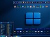
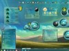
When the skin is implemented in Internet explorer I would like the menu bar fonts to be a dark colour to offset the light blue of Internet explorer it would also be nice if it were outlined and given a 3d effect. I would like the fonts in the Skin to be a bit bigger than what is found in most skins for weary tired eyes. I usually change the window colour to a colour of parchment or light yellow for contrast reasons, I usually end up colouring the scroll bar as a lot of skinners forget this, I also use and change the colours to Active and inactive title bar into a some form of gradients as I find most skinners just use a solid colour for this. I usually change the active inactive borders to to a dark red for inactive and a for active I usually use a dark colour of the theme. I also usually change the button face colour in almost all cases if it is gray. For Tool tip I usually just go White Font and Black background at minimum there should always be good contrast between the font and the back ground colour for easy reading same goes for Highlight and the highlight font. I am sure others can add what they would like to see in a skin colour wise and contrast wise creativity and colour contrast in my opinion makes for a good easy readable skin.
Please login to comment and/or vote for this skin.
Welcome Guest! Please take the time to register with us.
There are many great features available to you once you register, including:
- Richer content, access to many features that are disabled for guests like commenting on the forums and downloading skins.
- Access to a great community, with a massive database of many, many areas of interest.
- Access to contests & subscription offers like exclusive emails.
- It's simple, and FREE!