































Venom - WIP
XP, Vista and Win 7
Monday, March 22, 2010 by vStyler | Discussion: WinCustomize Talk
k, so the concept was to get as far away from the last theme I did as possible and still be able to skin Win 7 completely and correctly.
I also wanted to make a red and black theme that took advantage of the dramatic contrasts that this color combo can achieve.
Devilish, menacing, provokative, I dunno.. thats what is running through my head as I throw this PS mockup together.
I suppose  I will be doing a light and dark windows version as I dont see anyway around it...
...so this one may take a while to complete but here it is in it early.. fluid stage.
Oh and I may just keep the small branding text... cos I know  would approve
will post updates as they are formulated.

 |
|
Page 9 of 20 | |
|
|---|

Reply #162 Wednesday, April 14, 2010 7:32 AM
Just had to do the jinx job, eh Syd? 


Reply #164 Wednesday, April 14, 2010 8:40 AM
Have to say that this theme is looking very good. I patiently wait in anticipation of it's release. 

Reply #165 Wednesday, April 14, 2010 11:06 AM
This skin is looking Great !!!
I shiver with antici.....
.....pation

Reply #166 Wednesday, April 14, 2010 12:02 PM
me too, I sure wish there was a skinning auto-pilot
Reply #167 Wednesday, April 14, 2010 12:38 PM
I used neither....it is a simple shadow applied via DX. I will look into softening it a tad, but I like the stamped in look.
Thanks for input!

Reply #168 Wednesday, April 14, 2010 12:55 PM
I like the stamped in look also. I think it just looks to hard is all.  Remember, I'm a noob when it comes to skinning so take my advice with a grain of salt.
Reply #169 Thursday, April 15, 2010 11:51 AM
Yep, might soften the lower lighting on the text some, it is a little harsh right now, maybe a medium bluish grey, typically I color pick the BG color and bring up the lightness a bit at a time until it looks perfect.
Still, overall looking mighty nice Jim.
XP dark version, flying along now. 
Reply #170 Thursday, April 15, 2010 1:50 PM
Still, overall looking mighty nice Jim.
XP dark version, flying along now.
Dark? I have no dark stuff to work with!! Or do I? 


Reply #172 Thursday, April 15, 2010 3:39 PM
Oh...and John...just so you know...in that screeny I posted...the taskbar and systray thing is in Winstep and still had parts of another theme of yours I did and all that will get straightened out before it's done. Also...what text color are you going with on this?

Reply #175 Thursday, April 15, 2010 8:18 PM
Could have sworn I posted this already....
Is this better for the text John? And I wanted to run these blue mouseovers by you. I like, you may not.
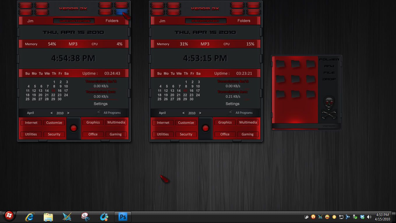
Reply #176 Thursday, April 15, 2010 8:44 PM
I think you're having a clarity/contrast problem with the red font, Jim.... to my ancient eyes, it's really hard to read. Otherwise lookin' good!
Reply #177 Thursday, April 15, 2010 8:49 PM
Lookin good Jim, as far as the blue goes, I'll leave that up to you, but there isnt anything but red and dark in the theme, all mousovers are red glows.
Here is a short vid showing the titlebar buttons that I've spent bloody ages on. Hopefully it posts correctly, I think I'll start posting more vids like this now that I have a PC that can handle it.
Reply #178 Thursday, April 15, 2010 9:07 PM
btw agree with doc on the red text, hard to read a wee bit.
 ......cool idea...
Reply #180 Thursday, April 15, 2010 9:29 PM
Videos now too, you never cease to amaze! Those titlebar buttons are fantastic!
Please login to comment and/or vote for this skin.
Welcome Guest! Please take the time to register with us.
There are many great features available to you once you register, including:
- Richer content, access to many features that are disabled for guests like commenting on the forums and downloading skins.
- Access to a great community, with a massive database of many, many areas of interest.
- Access to contests & subscription offers like exclusive emails.
- It's simple, and FREE!
|
|
Page 9 of 20 | |
|
|---|
Reply #161 Wednesday, April 14, 2010 6:15 AM
RND, I think the "stamped" text (black) looks too "hard". Especially on that folder drop window. Maybe too much inner shadow / and too much bevel. Just my 2 pennies.