































WC 2010 Beta Feedback
Tuesday, January 19, 2010 by Philly0381 | Discussion: WinCustomize 2011 Feedback
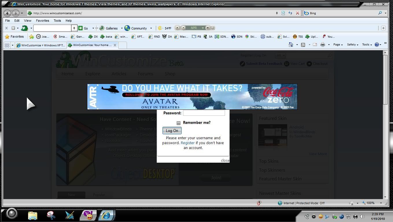
This one might well be expected since we are beta but I am signed in on the forums and still see advertisements. I'm using IE 8 on Win 7 Home Premium 64 bit. 
Overall it looks nice, understanding that it's new so getting use to the layout will take a little while for some folks. I have been looking at and using it off and on for a week or two.
Will there be an option to change the user interface colors?
Reply #2 Tuesday, January 19, 2010 3:08 PM
I'll say, and they cover the login so I can't.

Reply #3 Tuesday, January 19, 2010 3:14 PM
[Feature] [Request]
1. Explanation as to what will be customizable, User Level Privileges.
2. "Site Map" option at bottom of Home Page.
3. Under "Forums" tab on Home Page a drop down with "Recent Forum Activity", and specific Forums i.e. Support, General, etc.
[Bug]
1. Cross posted comment intended for Kenwas's work.
2. "Edit" yielded "Error" page appearing.
*note: Opera 10.10 Browser.

Reply #4 Tuesday, January 19, 2010 4:29 PM
[feature][request]
Access to the various galleries is now hidden under "explore". It's effectively an extra mouse-click. 3rd party software galleries have completely disappeared. I'm not sure I view that as an improvement since it makes things less accessible. If I were new to the site, I'd spend maybe 10-15 seconds, see the master skins for sale on the right, and probably breeze on by to find other goodies (ok, overstating it, but it is harder to find the 'stuff'). Master skins are good, but I as a customer see them more as an up-sell rather than the bread and butter of the OD product.
Suggestion: Smaller Master skin preview part along with a much more streamlined version of the sidebar rather than eliminating it entirely.
[feature]
The top button "Explore" is kind of vague. What am I exploring? Articles? Op-Eds? The whole site? My desktop? It makes sense given context, but takes a moment. Would "Skins" or the old "Gallery" be more clear?
[feature]
Enlarging skin previews still opens up a full-sized jpeg. I'd rather open one of those pop-up gallery browsers with next/back/exit or open a separate tab so I don't lose my place on the site. Edit: looking at the old gallery, I should clarify that popping a new tab under rather than over would be better. That way I can quickly click several previews open and view a bunch of them at once.
Everything else looks cleaner and more usable though. The filter operation has much more predictable behavior than the old dropdown operation.
Reply #5 Tuesday, January 19, 2010 5:11 PM
Why are there 3 threads about this? I think Moderation should try to move the notifications to the Beta feedback Forum thread.

Reply #6 Tuesday, January 19, 2010 5:13 PM
Please post to https://forums.wincustomize.com/373099 or in the beta feedback forum so that things can be tracked more easily. 
Please login to comment and/or vote for this skin.
Welcome Guest! Please take the time to register with us.
There are many great features available to you once you register, including:
- Richer content, access to many features that are disabled for guests like commenting on the forums and downloading skins.
- Access to a great community, with a massive database of many, many areas of interest.
- Access to contests & subscription offers like exclusive emails.
- It's simple, and FREE!
Reply #1 Tuesday, January 19, 2010 2:52 PM
Advertisements will be showing for the time being.