




























2 Cents Plzzz.
Tuesday, September 8, 2009 by iKashmir | Discussion: Skinning
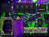
I'm workin on this graffiti icon pack and I'm stumped. I'm the type of artist that is never pleased with his own work I guess. I wanted to ask the community's opinion. Wich one should I use or should I just trash both ideas and start over again?
Option 1

Option 2

 |
|
Page 1 of 3 | |
|
|---|

Reply #2 Tuesday, September 8, 2009 9:30 PM
Hmmm....What about option 2's text on option 1's background?

Reply #3 Tuesday, September 8, 2009 9:33 PM
I like it elvee. Good idea i'll try that one out. 


Reply #6 Tuesday, September 8, 2009 9:46 PM
First one.
You may want to lighten the gradual shadow on the lettering though. I downloaded it and made it smaller and the gradual shading starts to blend in with the drips and the background/paint splatter. Just my two cents.

Reply #8 Tuesday, September 8, 2009 10:30 PM
Yea your right Po. Thanks everyone for the advise.
Reply #9 Tuesday, September 8, 2009 10:33 PM
Honestly I cant seem to fix it with the paint splatter so I think I'm just going to take that out. I think I'll use paintdrips for a paint bubble thing and see what that looks like.

Reply #10 Tuesday, September 8, 2009 11:02 PM
Both are a bit too 'clean' for graffiti.... the two 't's should be different [a bit]...
Reply #11 Tuesday, September 8, 2009 11:18 PM
Yea I understand your opinion Jafo but I personally belive that graffiti is what the artist makes it. So I think that I'm just goin to leave it alone. But thanks for your words.
Reply #12 Wednesday, September 9, 2009 5:39 AM
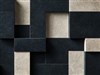
Well after a bit of furstration I just trashed every idea I had. I got so aggervated I couldn't think for hours. But I think this time I have finally figured it out. Try this one on for size.


Reply #13 Wednesday, September 9, 2009 5:52 AM
That is more tag like and so better, but then don't really like the bevel brick though makes the icons look too much like scrabble tiles. Graf artists don't have paint drips so you have that right too. Getting there 
Reply #14 Wednesday, September 9, 2009 3:19 PM
lol thanks Ausvet maybe ill add something to it to take away the "scrabble tile" look
Reply #15 Wednesday, September 9, 2009 3:54 PM
Looking at it, I like the NYC subway look...Spray Paint/Chalk...but this is your work, and everyone's 'taste' comes second to yours. Except mine...lol

Reply #16 Wednesday, September 9, 2009 4:06 PM
If ur going to use the bricks one, tone down the bevel some, its far too dark and sharpen the brick BG, looks quite blurry
Reply #17 Wednesday, September 9, 2009 4:08 PM
I'll take that into consideration JBHL. Maybe when I hit the internet icon or maybe the computer icon, you just never know.
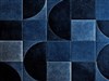
Ausvet, what do you think of this image? I'm going to add a shadow though to the finished image when I can come to one I like.

Reply #18 Wednesday, September 9, 2009 6:48 PM
You might check DA resources for some stock images of brick you can experiment with. *Just be sure to follow the artists stock rules.
Reply #19 Wednesday, September 9, 2009 6:50 PM
It's still blurry.
Reply #20 Wednesday, September 9, 2009 9:33 PM
How about now? I even changed the color of the brick that way the icon pack will be able to go with alot of dark-styled setups.

Please login to comment and/or vote for this skin.
Welcome Guest! Please take the time to register with us.
There are many great features available to you once you register, including:
- Richer content, access to many features that are disabled for guests like commenting on the forums and downloading skins.
- Access to a great community, with a massive database of many, many areas of interest.
- Access to contests & subscription offers like exclusive emails.
- It's simple, and FREE!
|
|
Page 1 of 3 | |
|
|---|
Reply #1 Tuesday, September 8, 2009 9:21 PM
I like #1.