






























SkinDex's First Project
Tuesday, July 15, 2008 by sAARGe | Discussion: Community
Introducing the new WC group skindex. The members are sAARGe, Libardo, MrPaul, Pixeleo, HapTork, RobJK, DEVJIT mkorashy and TheMasterBaron .... and.... We will be making a group as soon as the facility will be available on WC.
I think we should start with a fresh suite. We firstly need some graphics and ideas. I am not sure but we can also start with my GMX style graphics. Here is a sort of indication of what area is taken by whome....
Libardo .......... Cursor, Railendar
sAARGe .......... Logons, Boots, IP
DEVJIT .......... Wallpapers, Vista Logons
MrPaul .......... WB, Grafix
HapTork .......... all DX Stuff
Pixeleo .......... Docks, and whatever he wants
TheMasterBaron ......... Dream
mkorashy ........... IP
PuterDudeJim ........... DX Theme
There are no hard n fast guidelines of what one should do cause it will be always an every member contribution.
I believe whole WC community will support us. So lets get to work...
**Every single person is invited to give Ideas
 |
|
Page 14 of 17 | |
|
|---|


Reply #263 Monday, August 18, 2008 4:17 PM

Reply #264 Monday, August 18, 2008 7:06 PM
The mouse buttons look broken when you mouse over them, then they break even more when you mouse down. Is this what you mean? I can send a WIP desktopX theme to anyone who is in this thing. Just email me, or pm me your email. I will send a passworded zip that will use the same password as mrpaul sent his zips with.

Reply #266 Friday, August 22, 2008 7:04 PM

Reply #268 Saturday, August 23, 2008 1:30 PM
nice work
Thanx! I think it is finished. I guess I hold on until you are all ready to upload? Like we did on the Boxxi Tribute suite? MrPaul sent graphics, we need him to post permission for use of those graphics, in order to satisfy the stardock upload rules.

Reply #269 Sunday, August 24, 2008 10:40 PM
Reply #270 Tuesday, August 26, 2008 12:32 AM
That blue window is usually hidden, it is a drag and drop menu for your shortcuts. It's just showing for the screenshot.


Reply #271 Tuesday, August 26, 2008 1:20 PM
PDJ
1.can the Menu controllers be dark blue instead of i think yellow orangish pls
2.The Drive Usage in the 2nd Shot be glossy black or dark blue.
3.The watch be glossy black or Very Dark blue but glossy like an Orb with Skindex's Logo in the centre if u pls
Reply #272 Tuesday, August 26, 2008 2:53 PM
2.The Drive Usage in the 2nd Shot be glossy black or dark blue.
3.The watch be glossy black or Very Dark blue but glossy like an Orb with Skindex's Logo in the centre if u pls
I don't mean to be hard to deal with, but I like it the way it is. A screenshot is not as good as the actual theme, please email me and I will send you the theme. Send me the skindex logo, and I will put it in the clock that I used.
Reply #273 Tuesday, August 26, 2008 4:50 PM
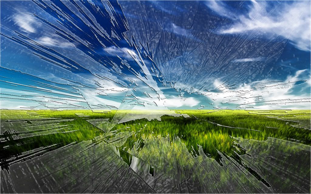
here guys a preview of the wall..all suggestions are welcome..but do remember i have limited skills


and the black shadows

Reply #275 Tuesday, August 26, 2008 6:30 PM
i think the first without shadows is perfect ....

Reply #276 Tuesday, August 26, 2008 6:47 PM

Reply #278 Tuesday, August 26, 2008 8:04 PM
MB pls forgive my skills ...I can only try
Reply #279 Thursday, August 28, 2008 6:50 AM
but anyway its ready to submitting wall.

Please login to comment and/or vote for this skin.
Welcome Guest! Please take the time to register with us.
There are many great features available to you once you register, including:
- Richer content, access to many features that are disabled for guests like commenting on the forums and downloading skins.
- Access to a great community, with a massive database of many, many areas of interest.
- Access to contests & subscription offers like exclusive emails.
- It's simple, and FREE!
|
|
Page 14 of 17 | |
|
|---|
Reply #261 Monday, August 18, 2008 2:24 PM
Anyone involved in this suite can email me for a working copy, password will be the same as the one mrpaul gave us.