


What was Wacom thinking!?!
Was the old logo *SO* bad?
Tuesday, October 2, 2007 by ZubaZ | Discussion: Industry
Ever since I started using a tabletPC I've wanted a Wacom tablet. The PC I have is nice enough but the screen is too small and it wasn't designed for art work. It can get the job done, but it's just not there.
But now . . .I just don't know. I worry about direction and goals when i see things like this.
But now . . .I just don't know. I worry about direction and goals when i see things like this.
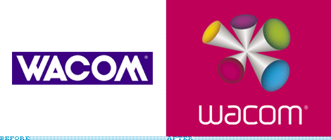
"Wacom, the Japanese
company responsible for the addictive tablets — try to pry one from any
designer and you will suffer the consequences — unveiled a new identity
and brand positioning last week, aimed at making headway into the
general consumer market while maintaining its attention on the
professional, hardcore user.
The new company motto, "Open Up. Sense More." — both technological and slightly kinky — is intended to lead the way in the new appreciation of this company, while their latest tablet design, Bamboo, hopes to cash in on the more general public willing to put their mouse, and carpal tunnel syndrome, behind them.
The old logo — with its mid-80s corporate design sensibility — has been replaced with a monoweight, mid-00s techie sensibility. (Do note the legacy of using the same shape, though inverted, for the W and M). The identity has been designed by Wolff Olins, them of London 2012 fame and of bright-color propensity (evident throughout the new Wacom web site). While the revised wordmark is a considerable improvement, the introduction of The Color Thing, all bouncy and weird, is a detriment to an otherwise simple evolution" [more]
What do you think of Wacom tablets and their new logo?
The new company motto, "Open Up. Sense More." — both technological and slightly kinky — is intended to lead the way in the new appreciation of this company, while their latest tablet design, Bamboo, hopes to cash in on the more general public willing to put their mouse, and carpal tunnel syndrome, behind them.
The old logo — with its mid-80s corporate design sensibility — has been replaced with a monoweight, mid-00s techie sensibility. (Do note the legacy of using the same shape, though inverted, for the W and M). The identity has been designed by Wolff Olins, them of London 2012 fame and of bright-color propensity (evident throughout the new Wacom web site). While the revised wordmark is a considerable improvement, the introduction of The Color Thing, all bouncy and weird, is a detriment to an otherwise simple evolution" [more]
 |
|
Page 1 of 3 |
|---|
 - Odd
- Odd

Excalpius
Reply #5 Tuesday, October 2, 2007 4:11 PM
Reply #5 Tuesday, October 2, 2007 4:11 PM
One of the worst logo designs I have ever seen. If any artist had shown that to me in a portfolio, I would never hire them.
It *might* have had some sense/relevance to a company that makes children's fireworks or toy trumpets or something. But for a company that makes graphics tablet?
I honestly think they are supposed to be pen "tips" all touching in the same place...for some unknown reason I cannot fathom.
It *might* have had some sense/relevance to a company that makes children's fireworks or toy trumpets or something. But for a company that makes graphics tablet?
I honestly think they are supposed to be pen "tips" all touching in the same place...for some unknown reason I cannot fathom.
Alternate Setting
Reply #6 Wednesday, October 3, 2007 7:47 AM
Reply #6 Wednesday, October 3, 2007 7:47 AM
Not so fussed about the logo - I don't expect it will adversely affect the professional market and it seems to fit in with their approach for marketing 'Bamboo'™
WWW Link.
I am pleased with the latest drivers for the intuous3(A4).
Previous drivers have been clunky for me at startup. Sometimes presenting a brief minimized window at top left of screen during bootup/login.
being UK based, the driver is as follows; Windows: Version 6.05-7 Multilingual; File size: 5.2 MB | Date: 12.9.2007. Now Wacom just melts right back into the background at bootup along with everything else - much smoother.

ZubaZ
Reply #8 Wednesday, October 3, 2007 8:12 AM
Now that I look at it like this . . the "bamboo" branding and new logo makes much more sense.
vely interesting
Reply #8 Wednesday, October 3, 2007 8:12 AM
Small details make a big difference.
Interesting . . whereas before there was an illusion that the "ends" could either buldge in or out, in your version (which looks much nicer) the ends only bulge out.Now that I look at it like this . . the "bamboo" branding and new logo makes much more sense.
vely interesting
vStyler
Reply #9 Wednesday, October 3, 2007 8:15 AM
Not on a bright pink BG they don't

Reply #9 Wednesday, October 3, 2007 8:15 AM
Small details make a big difference.
Not on a bright pink BG they don't


starkers
Reply #11 Wednesday, October 3, 2007 9:22 PM
Nah, 'tis still a fugly, sickly pink.
Reply #11 Wednesday, October 3, 2007 9:22 PM
Small details make a big difference.
Nah, 'tis still a fugly, sickly pink.
ZubaZ
Reply #12 Wednesday, October 3, 2007 9:49 PM
Reply #12 Wednesday, October 3, 2007 9:49 PM
I will be more than happy to take anyone's tablet that they want to stop using in protest!
vStyler
Reply #13 Wednesday, October 3, 2007 10:59 PM
and I'll be happy to give you a few bucks for it
Reply #13 Wednesday, October 3, 2007 10:59 PM
I will be more than happy to take anyone's tablet that they want to stop using in protest!
and I'll be happy to give you a few bucks for it


starkers
Reply #15 Wednesday, October 3, 2007 11:26 PM
You wouldn't want my tablet(s) ....there are side effects.... like baying at the moon, a taste for pickled gooseberries, rapid/unusual hair growth, accompanied by anxiety attacks and depression.
And tablets or not, I still don't like that effing pink.
Reply #15 Wednesday, October 3, 2007 11:26 PM
I will be more than happy to take anyone's tablet that they want to stop using in protest!
You wouldn't want my tablet(s) ....there are side effects.... like baying at the moon, a taste for pickled gooseberries, rapid/unusual hair growth, accompanied by anxiety attacks and depression.
And tablets or not, I still don't like that effing pink.
PixelPirate
Reply #16 Friday, October 5, 2007 9:31 AM
Reply #16 Friday, October 5, 2007 9:31 AM
PixelPirate loves his Intuos 3 both at work and at home, and will continue to buy Wacom boards even though their logo is so incredibly ugly.
I can't even describe how ugly I find that logo. It looks very unprofessional, unpolished, it looks like a quick mockup of an idea for a new logo, and then someone abandoned it, left it for dead but someone thought this was the final logo and used it anyway. Yuck.
I can't even describe how ugly I find that logo. It looks very unprofessional, unpolished, it looks like a quick mockup of an idea for a new logo, and then someone abandoned it, left it for dead but someone thought this was the final logo and used it anyway. Yuck.
HG_Eliminator
Reply #17 Friday, October 5, 2007 9:52 AM
Reply #17 Friday, October 5, 2007 9:52 AM
I think the logo would be much more accepted if the background wasn't A hideous pink...
ZubaZ
Reply #18 Friday, October 5, 2007 9:55 AM
Reply #18 Friday, October 5, 2007 9:55 AM
Do chicks buy Wacoms? Maybe they're trying to appeal to a new demographic?

ZubaZ
Reply #20 Friday, October 5, 2007 10:03 AM
Reply #20 Friday, October 5, 2007 10:03 AM
How politically incorrect of me!
Do the uterus bearing members of our species use Wacoms?
Better?
Do the uterus bearing members of our species use Wacoms?
Better?
Please login to comment and/or vote for this skin.
Welcome Guest! Please take the time to register with us.
There are many great features available to you once you register, including:
- Richer content, access to many features that are disabled for guests like commenting on the forums and downloading skins.
- Access to a great community, with a massive database of many, many areas of interest.
- Access to contests & subscription offers like exclusive emails.
- It's simple, and FREE!
|
|
Page 1 of 3 |
|---|
Reply #1 Tuesday, October 2, 2007 1:04 PM
I love my Tablet Wacom but i dislike their new logo not that i liked the old one though
will keep the one i made for my tablet settings for OD