


devdotnull
Comment #2 Sunday, November 24, 2002 2:43 PM
Comment #2 Sunday, November 24, 2002 2:43 PM
I Like it, but how did you get the subscreens to come out in different colors? All I get is the default blue. 

GreenReaper
Comment #3 Sunday, November 24, 2002 4:41 PM
Comment #3 Sunday, November 24, 2002 4:41 PM
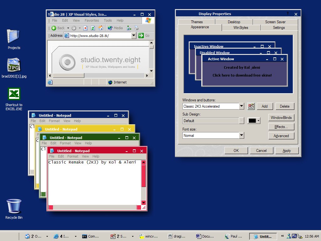
Sorry, but I have to disagree with bmetaelsky - I think this is a very poor conversion.
* The title text is not properly clipped - it stops far to the left of the buttons, and goes right behind the window icon (which is badly positioned)
* The help button is left black and in the wrong place and so is virtually invisible
* All the buttons and the titlebar text is too low down
* The buttons are not correctly positioned relative to one another (eg the close button is below the maximise)
* The skin appears to use no WB-specific features. Ports shouldn't simply copy (IMO) - they should adapt the skin so that it reaches it's full potential in the new form . . . otherwise, what's the point?
Overall I have to say it feels like it was just slapped into a converter and whipped out in 5 minutes.
GreenReaper
Comment #4 Sunday, November 24, 2002 4:46 PM
Comment #4 Sunday, November 24, 2002 4:46 PM
Oh yeah, and if you want an & in the author name, you need to put && into the AuthorName field.
SuperheroCanadian
Comment #5 Friday, November 29, 2002 12:19 AM
Comment #5 Friday, November 29, 2002 12:19 AM
how ironic that this is the 2000th skin kinda suits it being a clasic remake as the 2000th gj with the simplicity. 

Please login to comment and/or vote for this skin.
Welcome Guest! Please take the time to register with us.
There are many great features available to you once you register, including:
- Richer content, access to many features that are disabled for guests like commenting on the forums and downloading files.
- Access to a great community, with a massive database of many, many areas of interest.
- Access to contests & subscription offers like exclusive emails.
- It's simple, and FREE!


Comment #1 Sunday, November 24, 2002 1:28 AM