



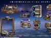























Lord of the Zombies_WIP
Monday, November 19, 2012 by Stramp | Discussion: WinCustomize Talk
New work in progress, comments welcome! 

Reply #2 Monday, November 19, 2012 2:01 PM
Thanks Doc, was not sure if too dark These are Warhammer Characters. Troll on the left is Rockgut the Troll. The Zombie lord is a 3d Character from CG hub. The Tenicles are 3d & from Poisen from his TenicleZ for Daz studio3d. It's supposed to be dark but not overly dark. So I will lighten it up some & resubmit. Any other advice will be welcome as I am still kinda new to 3d work & my eyes aren't what they used to be! LOL Big THX 
Reply #3 Monday, November 19, 2012 2:06 PM
Oh, Here's a link to the 1920x1200 preview, it may not be as dark in the larger version, but still will be on dark side.
Preview- http://dl.dropbox.com/u/13004762/Lord%20of%20the%20Zombies_1920x1200.jpg

Reply #4 Monday, November 19, 2012 2:57 PM
In my very very humble opinion I would lose the Troll and the Tentacles and stick with the Lord and add some thing more in line with the zombie lord to keep a consistent theme. Great imagination and love the candles and the zombie lord. The other images are good too, just out of place maybe.Again, my very humble opinion. 


Reply #5 Monday, November 19, 2012 3:45 PM
Would be better if the characters were more visible...just to dark. 
Reply #6 Monday, November 19, 2012 6:51 PM
Yea the troll isn't in the master & thought needed something for the go in the background the tenicles were thrown in to see what it would look like. Even the background could change. I will try to lighten the back as I think the Main character is alright. I lit the candles & well wanted to see if I was seeing things being too dark or not- needed second opinions! Thanks for looking, thoughts & advice Tech & Gizmo!
Reply #7 Monday, November 19, 2012 7:33 PM
Glad you are not discouraged, keep going, good stuff . Wish I could use dazz, have it, maybe someday I will try. Also, I kinda like the dark mysterious look, not to distracting for a wall!!! 
Reply #8 Wednesday, November 21, 2012 2:21 AM
No Doortech, discouraging is not having an idea, Frustrating is I have too many! I'm runnin outa drivespace. I might have 5 or six versions with 20 to 30 variations of a wall & some are really good but can't upload them all or have time for it! I have some really great stuff but those are waiting permissions as most were made before I knew much about painting or 3d work of my own. I'm still learning & will never know enough ever as the more I see the more I need to learn. 3d is a step learning curve & lots to pay attension to. And defintely read the instructions before delving into daz & take lots of notes! That way you won't get discouraged. I try to not be too distracting as it must be usable or make for a great logon to get you in the mood. Yes some of my stuff is a bit busy but I have some minimalistic stuff I'm working on but they have a great impact for unusual. I will try for those of you who don't like dark to lighten up a bit. I need some variety too! The wall was to be dark I just wasn't sure if I was seeing the just a bit too dark, Tho sometimes it helps in the desktop icons visibility of which is a concern for me. I do try to take all things into consideration but there are too many varibles to always accomodate every situation of items that might grace a destop. But those things within reason can be moved around or resized. The wall can't being static. Thank you so much and Constructive opinions are always welcome!
Reply #9 Wednesday, November 21, 2012 2:34 AM
I hear that. I have 2 terabytes and still need more space. On the subject of always more to learn, that is the most important thing I have learned in my short time at WC. I started out thinking I was great, now, not even close. Hurt at first, but now it is a challenge I intend to take on as long as I can. Practice, practice, like it for two days, then throw it out, start over. My daily routine. Someday,someday, I will make a truly magnificent skin though. Have a good one and I will look for you future works.
Reply #10 Wednesday, November 21, 2012 3:22 AM
Would be better if the characters were more visible 
Please login to comment and/or vote for this skin.
Welcome Guest! Please take the time to register with us.
There are many great features available to you once you register, including:
- Richer content, access to many features that are disabled for guests like commenting on the forums and downloading skins.
- Access to a great community, with a massive database of many, many areas of interest.
- Access to contests & subscription offers like exclusive emails.
- It's simple, and FREE!
Reply #1 Monday, November 19, 2012 6:49 AM
It's very dark, Stramp... also... the character on the left? Is that a Troll? Not sure of the tentacles, but if you say so...ok. The one on the right looks good... but the overly dark tone suggests this was originally a "Davie Jones Locker" type theme...