









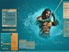
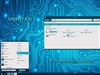













NextVS WB - RELEASED
Sunday, June 24, 2012 by LightStar | Discussion: Sneak Previews
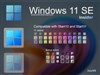
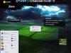
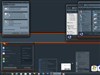
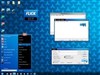
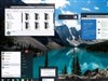
Well, gave it a whole day before I decided on my next skin! Let me know what you think. 


Reply #2 Sunday, June 24, 2012 2:05 PM
It goes from 1 button, to 2 on mouse over, to 3 on press Doc.

Reply #3 Monday, June 25, 2012 12:25 AM
I really like the shade of blue...lovely with the grey...
I'd like to see the start menu that blue... with the grey surround...instead of the black.... but that's probably a bit of a radical change... 
any which way.... it's a good looker.... 




Reply #6 Monday, June 25, 2012 7:39 AM
Looks good Tom, excellent choice of colors and concept!

Reply #8 Monday, June 25, 2012 8:09 AM
 Sorry all those who want N V S on the start button, but I have changed it again from what is shown in the screenshot. You'll have to wait a bit to see what I came up with though...


Reply #11 Tuesday, June 26, 2012 11:58 AM
Made a few changes to the skin and posted a new screenshot in the original post, hope the start button is good for you Doc, I like it as it fits the overall theme well.
Reply #12 Tuesday, June 26, 2012 1:41 PM
It fits... the letter thing could have as well, but it's your creation... and you do great skins.
Reply #13 Tuesday, July 3, 2012 10:11 AM
Please login to comment and/or vote for this skin.
Welcome Guest! Please take the time to register with us.
There are many great features available to you once you register, including:
- Richer content, access to many features that are disabled for guests like commenting on the forums and downloading skins.
- Access to a great community, with a massive database of many, many areas of interest.
- Access to contests & subscription offers like exclusive emails.
- It's simple, and FREE!
Reply #1 Sunday, June 24, 2012 1:19 PM
I like the general form, colors, shades and hues. Maybe instead of the 3 circles (start buppon) use "NVS" ? Just a thought.