



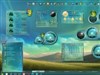


























Venom - WIP
XP, Vista and Win 7
Monday, March 22, 2010 by vStyler | Discussion: WinCustomize Talk
k, so the concept was to get as far away from the last theme I did as possible and still be able to skin Win 7 completely and correctly.
I also wanted to make a red and black theme that took advantage of the dramatic contrasts that this color combo can achieve.
Devilish, menacing, provokative, I dunno.. thats what is running through my head as I throw this PS mockup together.
I suppose  I will be doing a light and dark windows version as I dont see anyway around it...
...so this one may take a while to complete but here it is in it early.. fluid stage.
Oh and I may just keep the small branding text... cos I know  would approve
will post updates as they are formulated.

 |
|
Page 13 of 20 | |
|
|---|


Reply #243 Wednesday, April 21, 2010 2:17 PM
Please wait animation... unfortunately PC's are getting so fast animations on please wait are becoming useless on anything but a 1-2 second cycle.
Reply #244 Wednesday, April 21, 2010 2:26 PM
btw, the frames are smoother in actual animation. 


Reply #246 Wednesday, April 21, 2010 3:47 PM
 THEY SAID JOIN IT OR BE DEFEATED
You can RUN , and you can even HIDE (for a short time), but you CAN'T ESCAPE. 
I pledge full allegiance for I will not be defeated 
 BANG
BANG

Reply #248 Wednesday, April 21, 2010 7:21 PM
Sexy, might go just a shade brighter on teh red perhaps, hard to tell against a white page.. looks sharp tho 


Reply #250 Wednesday, April 21, 2010 9:37 PM
Hey John, on the Logoff screen by the Cancel button, the tiling of the diagonal pinstripe is off by a pixel.........I guess after a week of having My face 3 inches from the monitor staring at it...... 
 .....I've become super-sensitive to that pattern...
Reply #251 Wednesday, April 21, 2010 9:58 PM
I snagged that red off of the file you put on here. (The mockup) However, that part was flattened so I couldn't get any layerstyles from it. Plus, I think you've changed it a bit. Would you happen to have any updated psd's that have the correct look that we could have? Obviously I'd like it to be correct to match as best as possible, but I don't want to guess on it.
Reply #252 Wednesday, April 21, 2010 10:20 PM
I don't have anything, that would help, as far as that config goes... that hasn't been merged, I think its just missing the dodge brushes glow that's on most all the red elements, I would suggest just brightening the red area a few points or brushing some highlights on the ends perhaps.
Fred, good one, will take a look at that, odd considering its just a rectangle, something funny going on there, there's actually two images, one a bitmap one and it may be interfering... hopefully I can sort it out. Cheers...
you think you've been looking at it a lot ?



Reply #253 Wednesday, April 21, 2010 10:29 PM
Thanks everyone and Tom I tried few light shades here is what I ended up with.

Reply #254 Wednesday, April 21, 2010 11:51 PM
.....LOL, I know You've got it burned into Your corneas by now..........vStyler walks into a suit store and says to the salesman do any of these come in solid colors! 
Looking really cool Harley! 
Reply #255 Thursday, April 22, 2010 6:36 AM
In the psd I got from that link, all the active red parts with the highlights and gloss shown in the mockup were flatened. Buttons, Programs list etc. I'll do what I can from some of the latest screenshots you've put up. Thanks anyway. 
Reply #256 Thursday, April 22, 2010 8:45 AM
Thanks Natas, you pretty much have it nailed already
moving right along, almost finished with XP light version, I'm hoping to release sometime within next week if I stay on it.


Reply #259 Thursday, April 22, 2010 9:09 AM
WindowBlind 7 not included in right click menu..it's separated...oh is it Photoshop picture? [EDIT] i mean appearance tab...
Reply #260 Thursday, April 22, 2010 9:19 AM
Ive never seen WB 7 in a right click menu, Showing is a screen-shot of XP right click menu, light version, using WB7.
Fred, bug fixed, cheers. 
Please login to comment and/or vote for this skin.
Welcome Guest! Please take the time to register with us.
There are many great features available to you once you register, including:
- Richer content, access to many features that are disabled for guests like commenting on the forums and downloading skins.
- Access to a great community, with a massive database of many, many areas of interest.
- Access to contests & subscription offers like exclusive emails.
- It's simple, and FREE!
|
|
Page 13 of 20 | |
|
|---|
Reply #241 Wednesday, April 21, 2010 12:36 AM
Logoff screen.
XP done except file animations and please wait... the dark version that is.. now to completely change it all again.