

























Curried Cabbage WB
or...who's got the guts
Saturday, May 23, 2009 by Uvah | Discussion: WinCustomize Talk
In keeping with the finest of traditions I attribute to the great skinners of the WC community. I have but a single question. With all the jibe about curried cabbage what would a WB look like if someone would dare make one using the now infamous 'curried cabbage' as a theme. Any takers?
 |
|
Page 16 of 35 | |
|
|---|

Reply #302 Sunday, June 21, 2009 4:37 AM
Gas Sound Scheme By Night Train: https://www.wincustomize.com/skins.aspx?skinid=6&libid=69


Reply #303 Sunday, June 21, 2009 6:02 AM
Thanks for the explanation, AVMAN, I wasn't sure what is or isn't possible when it comes to animations... at least I now know mouse-overs aren't going to influence what I had in mind.
That's good to hear... hopefully, then, you'll be able to give Po` a few pointers/a bit of assistance with some of the ideas here. 
Yeah, I've had that one in mind myself... cos honestly, for recording purposes, I dunno if I can come up with the truly mythical 'barks' that'll be expected of me. Curried cabbage has been a bit scarce of late... well since mrs starkers went to Tassie a month back.


Reply #304 Sunday, June 21, 2009 6:36 AM
...that would explain the news reports of the ozone layer shrinking over Queensland in the last few weeks....

Reply #305 Sunday, June 21, 2009 6:59 AM
Let mrs starkers e-mail you the recipe then you fix it all up and hopefully the barks will be high and mighty. Get one of those mini recorder thingies and hold it close. You don't want to miss the more subtle effects. Then hook it up to your stereo system and turn up the volume. Not too loud though, windows and walls and such are bitching expensive to replace.
Avman...the visual effects could be just on mouse-over rather than something that does what it does when you call up the start menu. That could be static. Here's a thought...you know how the all programs looks like a long horizontal list when you call it up...is it possible to make it look different...say like a cloud or mist with some transparency? What color should the fonts be so they're easily read on that kind of background. You said with animations you could do most anything. If that's the case then...hmmm...can the all programs menu be animated or would that be a bit much? I'm trying to think what would make it different. With Curried Cabbage as a title it would almost certainly have to be. Just tossing stuff around in mine brain.

Reply #306 Sunday, June 21, 2009 9:15 AM
A green/yellow mist would best have black print...the Start Menu is hard coded, so you can only have black or white print...mist would make white not very practical.
Reply #307 Sunday, June 21, 2009 9:26 AM
We have ozone over Queensland??? Thought I'd depleted that years ago.
mrs starkers will be back on Wednesday.... but holding the recorder thingy close????
I was thinking more along the lines of placing the mic up the other end of the house when I let rip... any closer and it's likely to suffer permanent damage. Decibels of that magnitude are gonna do some serious damage to such sensitive electronic equipment, ya know. And don't worry about the "more subtle effects" being missed from that distance... with a second helping of curried cabbage (which is QUITE likely after a month of deprivation) those subtleties 'll be picked up in the next suburb, let alone from the next room with the door closed.


Reply #308 Sunday, June 21, 2009 10:01 AM
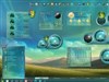
This is a rough draft of what I have so far.
- working on start menu in substyles - green, red, and Tasmanian Black Cabbage
- still toying with what to use for start button
- task bar- was going for one with rounded corners but frak it
- taskbar buttons - here are some samples - I'm not really happy with any of them. I don't think a 'bowl' is going to work. Comments welcome.

Reply #309 Sunday, June 21, 2009 10:23 AM
I think you're right about the large bowl but the smaller one looks good. Those red thingies with the white polka dots. They look a bit out of place. What is Australia's national bird? Is it the Kiwi? or is that New Zealand? Maybe use that image as slightly distorted...or a cabbage head with eyeballs (bloodshot of course due to the close proximity to starker's barks...with tears in them).
If the green/white mist is used then black text is a given. Would a 75% transparency effect it overmuch? Probably would considering the background. Hmmmmm......
Reply #310 Sunday, June 21, 2009 10:26 AM
I like the second from the left ... although, the red does make a nice contrast, Po'.
Maybe a little mushroom cloud, with the red/orange/black in it? Looks great so far! 
But it ain't smell so good...

Reply #311 Sunday, June 21, 2009 10:27 AM
For the taskbar button, I like the second one from the left. I think the bowl on it is a little too pale though. Maybe make it the same color as the More Programs Background on the start panel. Just a suggestion. It's looking realy good, Po!
Reply #312 Sunday, June 21, 2009 10:34 AM
Second one from the left with green goo in it. Coming along nicely.
Reply #313 Sunday, June 21, 2009 10:53 AM
I was going for the 'checkered table cloth'. It does look out of place.
I need a better bowl. I don't know how it will resize, especially for folks who have the windows7 plugin to shrink the button. The green is just one state. They won't all be green.
Reply #314 Sunday, June 21, 2009 3:44 PM
lets try this again.....................
Maybe one a bit wider and darker. Question...why is there a plugin to shrink buttons in Win7? I'm kind of wondering what this new OS has in store for me when I get my hands on it.
Reply #315 Sunday, June 21, 2009 6:48 PM
As for the taskbar buttons, I like the 2nd from the left and last on the right... and yeah, the same colour as the All Programs button on the start panel would look nicer.
I still feel the poles need to be shorter and maybe even for the discs to be slightly smaller. For some reason they look a little out of proportion with the rest of the panel... like size-wise they almost take up as much screen real estate as the main panel area, which should be given the primary focus as it contains all the important information, I believe.
I think this is what I was trying to say the other day, that it's more a perspective/focus thing (rather than a real estate issue... or more than) and that some elements/features should not stick out like dogs balls to steal too much focus from others.... if you know what I mean.
OK, here's another way of putting it! The poles and signs in Las Vegas have a whole skyline/cityscape to utilise/blend into, whereas the desktop is a limited space and perhaps some adjustments on the idea are needed to fit nicely within the confines, perameters of this space. Dunno if that makes any more sense or not, but that's how I'm seeing it. Please don't get me wrong here, I love the idea and thinks it's a cracker of a concept, but that's just me.
Maybe I'm just too fussy an old fart.... and all the gas has gone to my head.
I also think the gas masks would look good with bloodshot eyes behind them... and a tear or two (to reflect just how potent curried cabbage really is) rolling down/starting to appear.

Reply #316 Sunday, June 21, 2009 6:55 PM
Lookin good Po'ster and yes Starkers your too fussy an old fart... but we wouldnt have u any other way. I think the bowl will work if u leave enough space in the button to set ur sizing margins above.. or below it.
Main thing is your not going to feel accomplished in anyway until u start transitioning the mockup into a WB.... THEN your on ur way!
Rock on !
Reply #317 Sunday, June 21, 2009 7:24 PM
Quoth the Raven, "You got it!"
[quote who="Xiandi" reply="11" id="2270070"]For the taskbar button, I like the second one from the left. I think the bowl on it is a little too pale though. Maybe make it the same color as the More Programs Background on the start panel. Just a suggestion. It's looking realy good, Po!
Yes indeedy. Po'... don't listen to ^...he a skinner? JK, v...
Reply #318 Sunday, June 21, 2009 8:04 PM
It's for Vista to make the buttons look like windows7. 'Windows 7 taskbar Iconizer'
I've actually used it for quite a few months and like it. The only thing I don't care for is how it 'groups' similar windows automatically.
Reply #319 Sunday, June 21, 2009 8:06 PM
Yeah, it's all those years of inhaling noxious fumes.
I guess chronic watery eye syndrome has impaired my vision.
Reply #320 Monday, June 22, 2009 7:23 AM
Thanx Po for the links. Funny how each OS wants to mimic the next one coming up. XP wants to be Vista now Vista wants to be Win7. What'll it be next? 7 emulates 8 which emulates 9 which emulates 10 and they all wish they could emulate Curried Cabbage WB which is one of a kind. Take note MicroSoft......
(I wonder if anyone from MS reads these posts?)
Please login to comment and/or vote for this skin.
Welcome Guest! Please take the time to register with us.
There are many great features available to you once you register, including:
- Richer content, access to many features that are disabled for guests like commenting on the forums and downloading skins.
- Access to a great community, with a massive database of many, many areas of interest.
- Access to contests & subscription offers like exclusive emails.
- It's simple, and FREE!
|
|
Page 16 of 35 | |
|
|---|
Reply #301 Sunday, June 21, 2009 3:11 AM
Unfortunately the anitations can not be made Interative. I wanted to use them like live folders on Vista but in can be a looped animation only no even Mouseover can affect it!
However for the animation we can do just about anything!!
