
























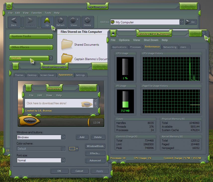
ecoLogical WB preview
Its GREEN!...but you can recolor it.
Friday, June 20, 2008 by I.R. Brainiac | Discussion: Sneak Previews
Tried something a little different for me.I wanted something where elements went behind the glass and wrapped around.
 |
|
Page 4 of 5 | |
|
|---|
I.R. Brainiac
Reply #62 Saturday, July 5, 2008 10:04 AM

Reply #62 Saturday, July 5, 2008 10:04 AM
Thanks Mess...the psd for it is in the graphics section now if needed. 


PuterDudeJim
Reply #64 Saturday, July 5, 2008 9:53 PM

Reply #64 Saturday, July 5, 2008 9:53 PM
I will probably need to update mine. Jumped the gun...impatient me...lol.
Neil Banfield
Reply #65 Sunday, July 6, 2008 5:44 AM
Reply #65 Sunday, July 6, 2008 5:44 AM
Are you taking advantage of the WB layers feature?
I.R. Brainiac
Reply #66 Sunday, July 6, 2008 8:16 AM
Reply #66 Sunday, July 6, 2008 8:16 AM
Not yet Neil...I'm still building XP in 5 and will move into 6 when I begin the Vista sub.I still dont know what blend modes are available on the layers yet.I'm looking forward to trying them out tho.
Would be incredible if they could actually be z leveled to ride on top of icons and text.
Would be incredible if they could actually be z leveled to ride on top of icons and text.

vStyler
Reply #67 Sunday, July 6, 2008 1:37 PM

Reply #67 Sunday, July 6, 2008 1:37 PM
This is one heck of a theme... look forward to it being finished.
sb_41
Reply #68 Monday, July 7, 2008 6:05 PM

Reply #68 Monday, July 7, 2008 6:05 PM
nice skin! Will there be a Vista substyle?
(Reminds me of a lime...)
(Reminds me of a lime...)
ALMonty
Reply #69 Monday, July 7, 2008 6:25 PM

Reply #69 Monday, July 7, 2008 6:25 PM
Looks great IR. I'm not especially fond of the flower and the bug, But I'll wait to see how the whole thing turns out.
zakai1369
Reply #70 Wednesday, July 9, 2008 12:35 AM
Awesome

Reply #70 Wednesday, July 9, 2008 12:35 AM
Start menu and taskbar lookey look.A triple taskbar without repeat or stretch...neato
Awesome


messiah1
Reply #72 Friday, July 11, 2008 2:18 PM
Looks like the green area on the right needs to go up a pixel or two...

Reply #72 Friday, July 11, 2008 2:18 PM
reworked on the meters. hope you like them Mike
Looks like the green area on the right needs to go up a pixel or two...
I.R. Brainiac
Reply #73 Friday, July 11, 2008 2:57 PM
Reply #73 Friday, July 11, 2008 2:57 PM
Messiah is correct...plus,you might shorten up the right side with the text(wasted space)and the text shadow is pretty strong.
Bottom left shiny part isnt needed.(misaligned and not connected to the back)
The rest is fine as sunshine.
Bottom left shiny part isnt needed.(misaligned and not connected to the back)
The rest is fine as sunshine.
bilbo1930
Reply #75 Saturday, July 12, 2008 2:17 AM
yeah pretty nice..maybe little too dark that textshadow..
Reply #75 Saturday, July 12, 2008 2:17 AM
reworked on the meters. hope you like them Mike
yeah pretty nice..maybe little too dark that textshadow..
philmar83
Reply #76 Saturday, July 12, 2008 7:10 AM
Thanks for the advice messiah Mike and Bilbo.
it was a previeww not a final one, I think I will change somme things after the release of the WB
Thanks Jim
Reply #76 Saturday, July 12, 2008 7:10 AM

Thanks for the advice messiah Mike and Bilbo.
it was a previeww not a final one, I think I will change somme things after the release of the WB
Thanks Jim

Please login to comment and/or vote for this skin.
Welcome Guest! Please take the time to register with us.
There are many great features available to you once you register, including:
- Richer content, access to many features that are disabled for guests like commenting on the forums and downloading skins.
- Access to a great community, with a massive database of many, many areas of interest.
- Access to contests & subscription offers like exclusive emails.
- It's simple, and FREE!
|
|
Page 4 of 5 | |
|
|---|
Reply #61 Saturday, July 5, 2008 9:04 AM