




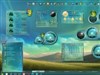


























Mechanoidess for Vista and xp....work in progress
Sunday, March 23, 2008 by Vampothika | Discussion: Community
just starting at the moment.......still in building mode.....will post updates.......! 




Vampothika
Reply #5 Sunday, March 23, 2008 3:50 PM
Reply #5 Sunday, March 23, 2008 3:50 PM
hehe thanks guys!! ill be probably updating another picture tonight......ill be working on this baby all day......( i secretly have fallen in love with her....)
vStyler
Reply #6 Sunday, March 23, 2008 3:56 PM

Reply #6 Sunday, March 23, 2008 3:56 PM
From a design standpoint , seems a little off not having the decor integrate into the menu in some placesas opposed to just ending there.. It's as if the adornment was behind the menu. Im assuming your going to animate the sprockets.
I know it's a WIP tho, just my 2c.
I know it's a WIP tho, just my 2c.

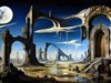
my wall
Reply #7 Sunday, March 23, 2008 4:12 PM

Reply #7 Sunday, March 23, 2008 4:12 PM
I like this style, very unique. Grotesque art fused with stoic machinery. What caught my eye was the stylization of the female character. Though the abstract gears and non-objective symbols inscribed on them also held my interest. Indeed, an exceptional masterpiece.
Phoon
Reply #8 Sunday, March 23, 2008 4:20 PM

Reply #8 Sunday, March 23, 2008 4:20 PM
Kitty,
Meant in a constructive manner, I must agree with vStyler.
It looks like you put forth a great deal of work and detail in to the "decor" but not the menu itself. I think you could greatly enhance your themes if you went the extra mile to do that!
Meant in a constructive manner, I must agree with vStyler.
It looks like you put forth a great deal of work and detail in to the "decor" but not the menu itself. I think you could greatly enhance your themes if you went the extra mile to do that!


Vampothika
Reply #10 Sunday, March 23, 2008 10:40 PM
Reply #10 Sunday, March 23, 2008 10:40 PM
ookay my update......got my plugs connected and so forth...still a fair bit to go..
wow, thanks for the coments, i expected nothing but screams and people running in the opposite direction....
wow, thanks for the coments, i expected nothing but screams and people running in the opposite direction....

Vampothika
Reply #11 Sunday, March 23, 2008 10:41 PM
Reply #11 Sunday, March 23, 2008 10:41 PM
wow, this image is really bad quality......humph.......i really wanted people to see it properly....... 

starkers
Reply #12 Sunday, March 23, 2008 11:02 PM

Reply #12 Sunday, March 23, 2008 11:02 PM
The second panel is much improved on the first (forgetting image quality ), tho I think I'd try to incorporate the female's image more into the top of panel itself... more like a soft transition between the two, so that it blends rather than appearing as attached.
The concept is absolutely brilliant, however, and I see the HR Giger influence which I absolutely love... so when the tweaking's all done, I have no doubt this WB will be another high quality kitty malone masterpiece.
), tho I think I'd try to incorporate the female's image more into the top of panel itself... more like a soft transition between the two, so that it blends rather than appearing as attached.The concept is absolutely brilliant, however, and I see the HR Giger influence which I absolutely love... so when the tweaking's all done, I have no doubt this WB will be another high quality kitty malone masterpiece.


Please login to comment and/or vote for this skin.
Welcome Guest! Please take the time to register with us.
There are many great features available to you once you register, including:
- Richer content, access to many features that are disabled for guests like commenting on the forums and downloading skins.
- Access to a great community, with a massive database of many, many areas of interest.
- Access to contests & subscription offers like exclusive emails.
- It's simple, and FREE!
Reply #1 Sunday, March 23, 2008 9:23 AM