































black theme
quality and simple. for everyday use
Tuesday, October 23, 2007 by 1MrPaul1 | Discussion: WindowBlinds
i waiting for yours comments....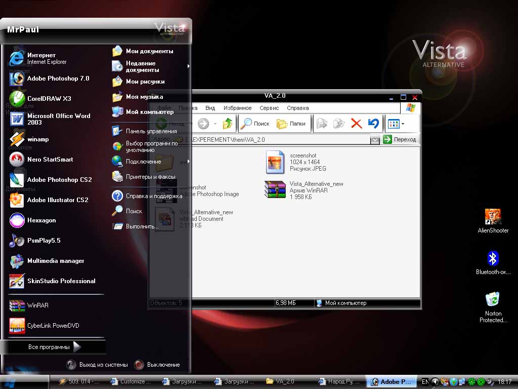
WWW Link
(Moved by admin)
SKoriginals
Reply #2 Tuesday, October 23, 2007 11:34 AM

Reply #2 Tuesday, October 23, 2007 11:34 AM
It could use some work... its not bad per-say but could use some 'cleaning up'
Some of the edges could be crisper and like the top of the start menu looks like its not really part of it but sitting on top. If thats intentional then I guess thats fine. Concept is pretty good and there is a 'loyal following' of those who like dark or black themes.
Some of the edges could be crisper and like the top of the start menu looks like its not really part of it but sitting on top. If thats intentional then I guess thats fine. Concept is pretty good and there is a 'loyal following' of those who like dark or black themes.
unclerob
Reply #3 Tuesday, October 23, 2007 12:00 PM

Reply #3 Tuesday, October 23, 2007 12:00 PM
it's not bad, I agree that the edges could be cleaner/crisper.
I would like to see vista style min/max/close buttons instead of just the symbols you're using for windowframe buttons - those buttons are what really make a vista theme. I do like the gloss & transparency, start panel & start button are nice too.
I would like to see vista style min/max/close buttons instead of just the symbols you're using for windowframe buttons - those buttons are what really make a vista theme. I do like the gloss & transparency, start panel & start button are nice too.
messiah1
Reply #4 Tuesday, October 23, 2007 12:19 PM

Reply #4 Tuesday, October 23, 2007 12:19 PM
I think the gloss on the top of the frames is much to powerful...bring down the opacity a bit. I agree with unclerob, the min/max/close buttons need something else.
jamespaulp
Reply #5 Tuesday, October 23, 2007 12:28 PM

Reply #5 Tuesday, October 23, 2007 12:28 PM
Good looking skin. I am not a fan of dark though.
It would be nice, NT, if you could expand on that a bit.
Too much clash between the highlighting and the black
It would be nice, NT, if you could expand on that a bit.
messiah1
Reply #6 Tuesday, October 23, 2007 12:32 PM
He may be talking about the gloss on the top of the frames. To me, it looks slapped on rather than part of the frame. Try to lower the opacity a bit so you can see some of the black through it...or it may be the black frames against the white background...have you tried a light grey?
Reply #6 Tuesday, October 23, 2007 12:32 PM
It would be nice, NT, if you could expand on that a bit.
He may be talking about the gloss on the top of the frames. To me, it looks slapped on rather than part of the frame. Try to lower the opacity a bit so you can see some of the black through it...or it may be the black frames against the white background...have you tried a light grey?
jamespaulp
Reply #7 Tuesday, October 23, 2007 1:22 PM
Thank you.
Reply #7 Tuesday, October 23, 2007 1:22 PM
to lower the opacity a bit so you can see some of the black through it
Thank you.
NightTrainthedark
Reply #8 Tuesday, October 23, 2007 2:26 PM
That is exactly what I meant. After a period of usage the white vs black will tend to burn the eyes a little. Otherwise it looks like a decent skin. Try a maximum of 60% transparency but less is better when it comes to usage. If form is more important than function, anything goes. Perhaps a little too transparent but it's hard to tell from a screenshot.
When I reread my initial comment I see it can be recieved as kinda harsh. I didn't mean it that way, was only having fun.

Reply #8 Tuesday, October 23, 2007 2:26 PM
to lower the opacity a bit so you can see some of the black through it
That is exactly what I meant. After a period of usage the white vs black will tend to burn the eyes a little. Otherwise it looks like a decent skin. Try a maximum of 60% transparency but less is better when it comes to usage. If form is more important than function, anything goes. Perhaps a little too transparent but it's hard to tell from a screenshot.
When I reread my initial comment I see it can be recieved as kinda harsh. I didn't mean it that way, was only having fun.
messiah1
Reply #9 Tuesday, October 23, 2007 2:30 PM
no problem at all. post a new shot when you have it changed.
Reply #9 Tuesday, October 23, 2007 2:30 PM
Thank you.
no problem at all. post a new shot when you have it changed.
jamespaulp
Reply #10 Tuesday, October 23, 2007 3:29 PM
Oops, this is not my skin. I was just curious about the remark as I myself may be making such mistakes in my work.
Reply #10 Tuesday, October 23, 2007 3:29 PM
post a new shot when you have it changed
Oops, this is not my skin. I was just curious about the remark as I myself may be making such mistakes in my work.
messiah1
Reply #11 Tuesday, October 23, 2007 4:03 PM
hehe, you didn't mention that.
Reply #11 Tuesday, October 23, 2007 4:03 PM
Oops, this is not my skin. I was just curious about the remark as I myself may be making such mistakes in my work
hehe, you didn't mention that.
jamespaulp
Reply #12 Tuesday, October 23, 2007 4:29 PM
May be it is the paul in both my name and the original poster caused the consfusion.
Reply #12 Tuesday, October 23, 2007 4:29 PM
hehe, you didn't mention that
May be it is the paul in both my name and the original poster caused the consfusion.
HG_Eliminator
Reply #13 Tuesday, October 23, 2007 6:55 PM

Reply #13 Tuesday, October 23, 2007 6:55 PM
the light source looks off to me. the top window frame looks great, but the user pane and status bar pane have 2 light sources one on top and one from the bottom. the start button looks awesome but here again the task bar background has 2 light sources and screws it all up..
in each of these areas the light is also too strong and washes out the color resulting in an inconsistent look.Also add some awesome original buttons, the start button is killer maybe different variations of it would be good...
I will say it has potential and I love the concept. keep up the good work. I hope my comments helped
HG_Eliminator
Leader of the dark skin following, SK mentioned.
in each of these areas the light is also too strong and washes out the color resulting in an inconsistent look.Also add some awesome original buttons, the start button is killer maybe different variations of it would be good...
I will say it has potential and I love the concept. keep up the good work. I hope my comments helped
HG_Eliminator
Leader of the dark skin following, SK mentioned.
1MrPaul1
Reply #14 Wednesday, October 24, 2007 9:32 AM

Reply #14 Wednesday, October 24, 2007 9:32 AM
thank you! everybody! of course your comments helps me. I don't need just good words, for me more important objective look on my work.
i don't have enough time for skining. But i take into account all comments and try to correct this skin.
(sorry for bad english, i understand everythink but can't write well)
i don't have enough time for skining. But i take into account all comments and try to correct this skin.
(sorry for bad english, i understand everythink but can't write well)
messiah1
Reply #15 Wednesday, October 24, 2007 9:35 AM
ha, yer right, I just looked...sorry bout that mate. Loooooooong day.
Reply #15 Wednesday, October 24, 2007 9:35 AM
May be it is the paul in both my name and the original poster caused the consfusion.
ha, yer right, I just looked...sorry bout that mate. Loooooooong day.
mikri7
Reply #16 Saturday, May 24, 2008 1:01 AM
Reply #16 Saturday, May 24, 2008 1:01 AM
Is there a way to change the colors or the spin direction of the aero graphic in the cursor?
ZubaZ
Reply #17 Saturday, May 24, 2008 11:54 AM
1) it's better to start a new post for an unrelated topic
2) it's better to post in a category that fits your topic (OS Customization, not Windowblinds)
3) CursorFX allows you to make your own cursors with whatever spin you can create.

Reply #17 Saturday, May 24, 2008 11:54 AM
Is there a way to change the colors or the spin direction of the aero graphic in the cursor?
1) it's better to start a new post for an unrelated topic
2) it's better to post in a category that fits your topic (OS Customization, not Windowblinds)
3) CursorFX allows you to make your own cursors with whatever spin you can create.
1MrPaul1
Reply #18 Saturday, June 7, 2008 7:47 AM
Reply #18 Saturday, June 7, 2008 7:47 AM
Heh new comments on this my old post.
Thank for everyone who comment my work. I made suite series Black and White, only with yours help.
Thank for everyone who comment my work. I made suite series Black and White, only with yours help.
Please login to comment and/or vote for this skin.
Welcome Guest! Please take the time to register with us.
There are many great features available to you once you register, including:
- Richer content, access to many features that are disabled for guests like commenting on the forums and downloading skins.
- Access to a great community, with a massive database of many, many areas of interest.
- Access to contests & subscription offers like exclusive emails.
- It's simple, and FREE!
Reply #1 Tuesday, October 23, 2007 11:33 AM