























Lantana Master Skin - WIP
Should be ready in a about a week.
Monday, June 14, 2010 by retiredmaster | Discussion: Sneak Previews


 |
|
Page 2 of 3 | |
|
|---|

Reply #22 Thursday, June 17, 2010 2:09 PM
Tis nearly here. The WB is done and being tested, wallpaper is done, dock bgs made, clock bits done - just need to make the gadgets, then it's the screenshots, then it's up on my website, then it's up on here.


Reply #24 Saturday, June 19, 2010 8:21 AM
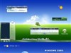
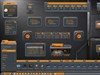
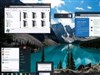
Really nice: the way the colours are very matt makes it look very natural. What's the wallpaper used in the screenshot?

Reply #25 Saturday, June 19, 2010 8:37 AM
Reply #26 Saturday, June 19, 2010 12:29 PM
The wallpaper in the screenshot can be found here:
http://interfacelift.com/wallpaper_beta/details/2225/cherry_flowers.html
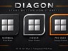
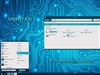
And a more recent shot from WB config may indicate about the start button:


Reply #27 Saturday, June 19, 2010 2:10 PM
Very elegant looking skin, love the colors and shape of the start menu at the top.
Is it possible to include a different start button, even the orb without the flag? I love all your skins but don't buy them (or other artists skins) because of the win flag/orb as a start button. I have an extremely strong aversion to Win or Mac start buttons but don't like to use Start Killer. As vStyler say's "you can't please everyone"...but you could sell more skins with that extra option.
I'm not trying to be rude, just asking. 
Reply #28 Saturday, June 19, 2010 2:13 PM
Oops, I didn't see reply #26 before commenting. Awesome!




Reply #32 Saturday, June 19, 2010 9:19 PM
Not to be a party pooper, but that flower in the start panel kills it for me. I can always edit that graphic though...
I hope you're going to include that original start button. Even a Win flag is better than a flower.
Not trying to hate on your design choice; it's just that I don't have a frilly bone in my body. 
Reply #33 Saturday, June 19, 2010 10:11 PM
I agree with the flower in the start menu being too much.....it makes the blind a little feminine......i think the start button is a lovely alternate button...but including a plainer one means there is something to suit different tastes...
Reply #34 Saturday, June 19, 2010 10:48 PM
Not sure it's 'too much'. I think it needs to be 'simpler' (abstract)...more Japanese....like the ume flower.
Reply #35 Sunday, June 20, 2010 12:19 AM
OOOOOOOOOOOOOOOOOOOOOOOOOOOOOOOOOOOOOOOOOOOOOOOOOOOO....Purdy!!!!!!!

Reply #37 Sunday, June 20, 2010 6:30 AM


Reply #38 Sunday, June 20, 2010 7:34 AM
Ever notice that everyone always has an opinion about start buttons. I say it is fully up to the artist what he or she does for a start button.
Looks exellent, Tim 
Reply #39 Sunday, June 20, 2010 8:02 AM
^ I believe we agree. It is fully up to the artist. So, why a WIP? I would think it was posted as a W.I.P. seeking to generate enthusiasm, participation and therefore opinions/tastes are naturally expressed.
I don't think essorant just wants "ooohs and aaahs". He's a Master Skinner in every sense, as you are, Tim. He has the final say, and that's understood by all from the get go. Start Buttons? I think they're a major part of the skin's 'personality'.
I wish there were a library of Start Button graphics to use as the skinner wishes (with appropriate credit) with modification or not....I know there's supposed to be one at dA....at least there was a post about it some time ago. Maybe there should be a Start Button Contest? Why not?
I understand the commercial aspect, and respect it. So, shouldn't an artist listen to his audience/fellow community members?
This WIP concept isn't just advertising: It allows artistic participation for non skinners and that's a good thing, imo. I believe it encourages people to be more active. The more the merrier, as long as it's in good taste, and done respectfully balancing likes and other feelings. Words should be carefully chosen.
That's only my opinion though, and everyone is entitled to his/her own. I don't think any creative process should be stifled...quite the opposite: It should be encouraged, supported and shared. Isn't that part of "Community"?...well, I hope it can be.
As Harley says, "Skinner fuel!".
Reply #40 Sunday, June 20, 2010 8:21 AM
There will be a choice of start buttons, in fact, I might do away with the 'flag' on the original version so you can have just an 'orb' or a 'flower'. And I might make the branding flowers different for the 'orb' version so you can have flowery or non-flowery skin
Please login to comment and/or vote for this skin.
Welcome Guest! Please take the time to register with us.
There are many great features available to you once you register, including:
- Richer content, access to many features that are disabled for guests like commenting on the forums and downloading skins.
- Access to a great community, with a massive database of many, many areas of interest.
- Access to contests & subscription offers like exclusive emails.
- It's simple, and FREE!
|
|
Page 2 of 3 | |
|
|---|
Reply #21 Thursday, June 17, 2010 12:57 PM
I always liked overlapping glass parts...looks good mister.